Loading …
Reklame Stencil
Type Design
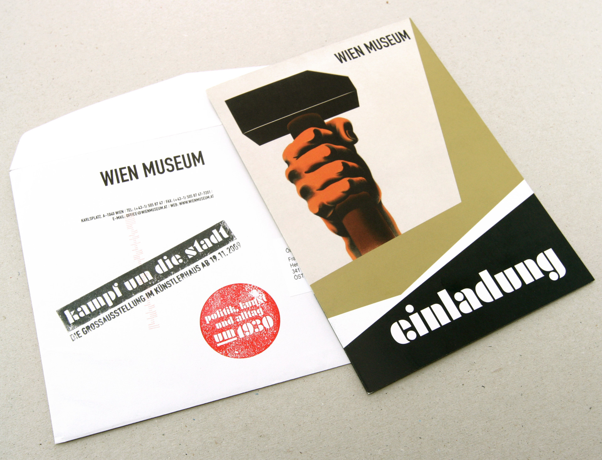
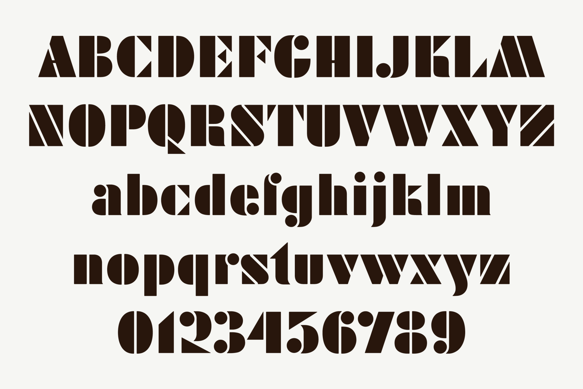
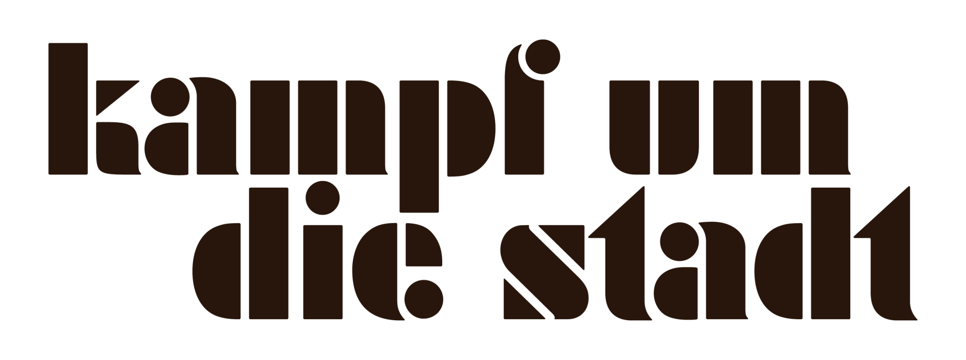
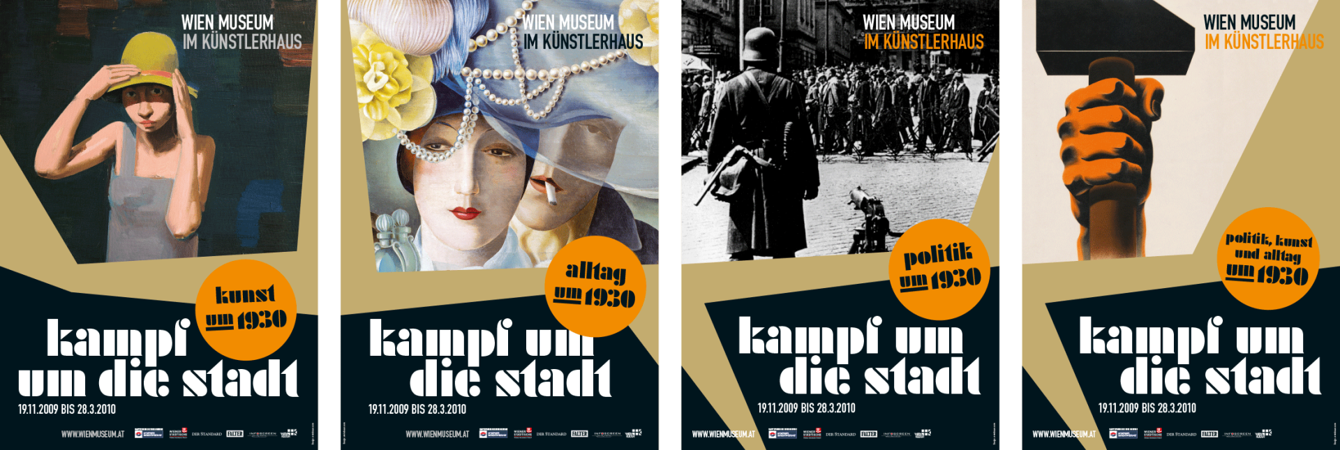
During research for the exhibition design of „Fight for the City. Politics, Art and Everyday Life in the 1930s“ at Wien Museum, it became pretty obvious that a specific font would give the exhibition’s appearance and its communication media a unique character. Based on the title font of a former magazine, we created a whole family with minuscules and majuscules.
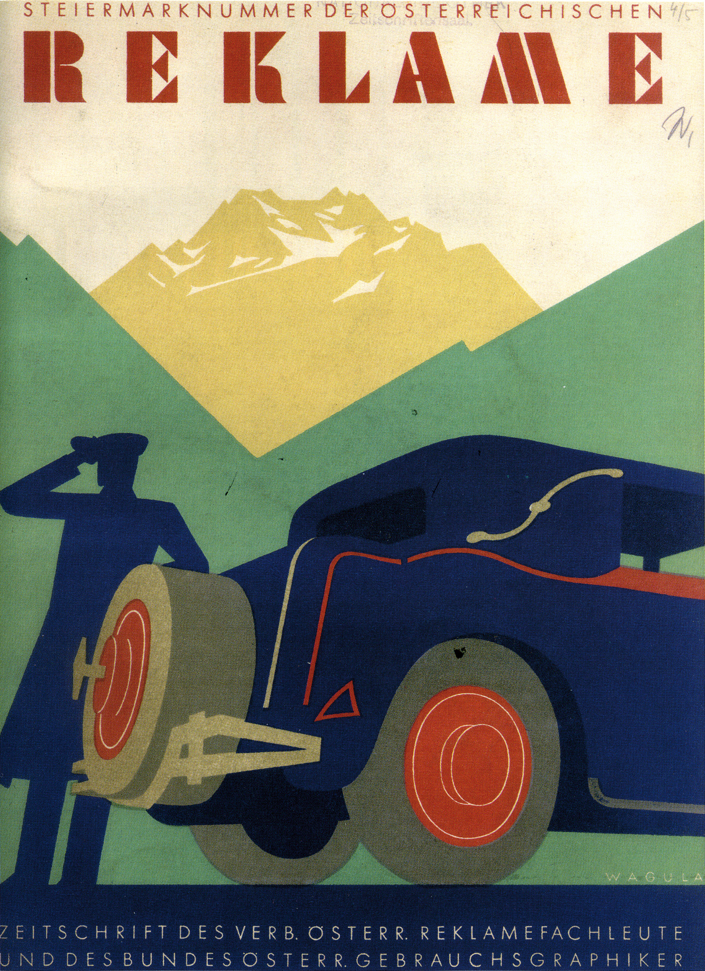

In the 1920s, back when visual designers were still called commercial artists, there was no difference between art directors, contact persons and copy writers. Often, designers combined all skills in one person. An own magazine showed the rising interest in this new kind of job profile: the so-called „Austrian Advertisement“ (Österreichische Reklame) was first published in 1926 and it presented interesting personalities of the growing design world, such as Joseph Binder who invented the famous “Meinl Moor”.
Einleitung
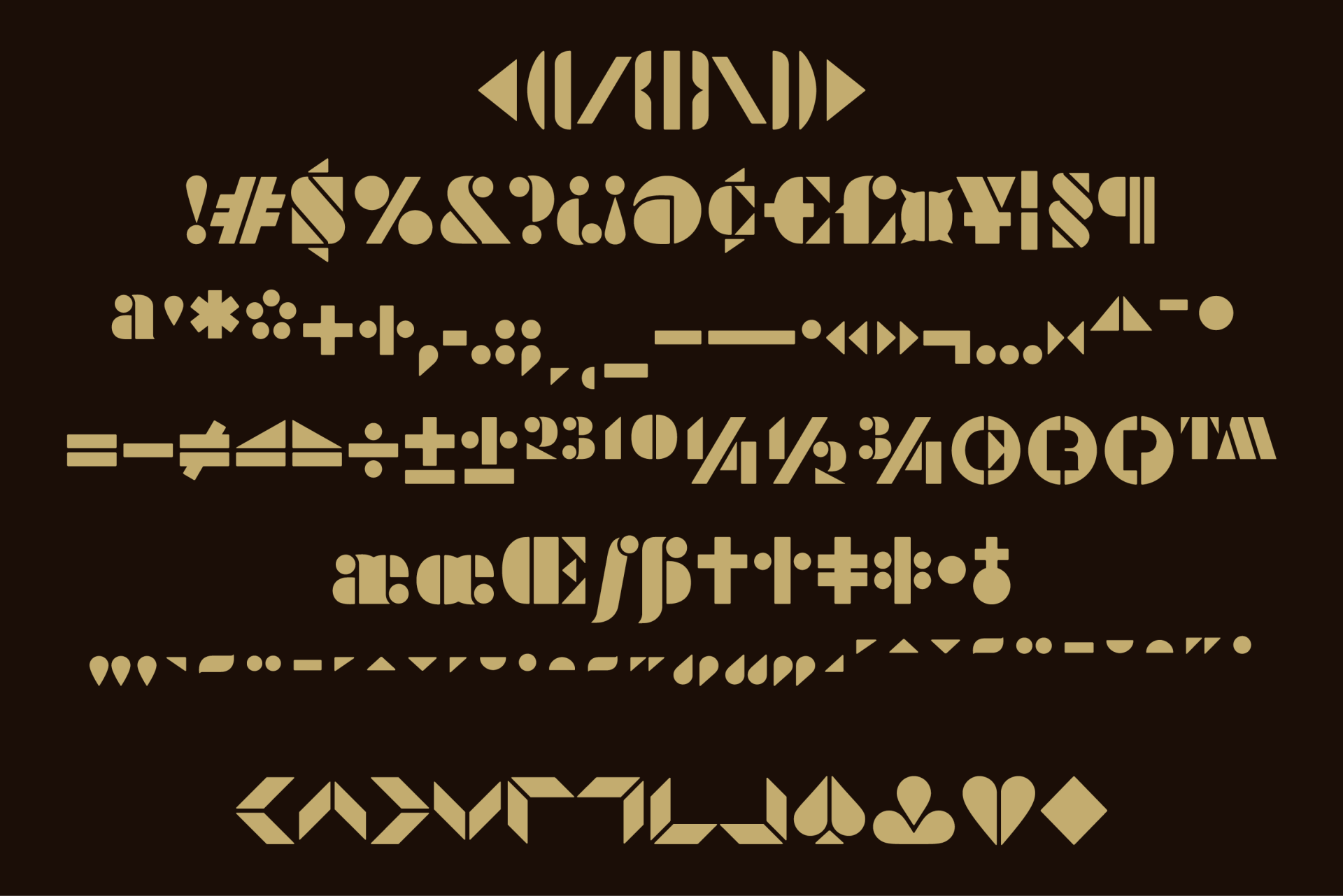
Just like the Futura Black, the title font of the magazine is based on simple basic shapes, like circle, triangle and square. Comparing the font with the Futura Black, it showed that the Futura doesn’t coherently use the radicality on the whole font family, neglecting numbers and special characters. The design of a font for the exhibition was therefore based on the magazine title, aiming to stick with the consequence of using few elements only to build a font family like with a simple construction kit.
Einleitung
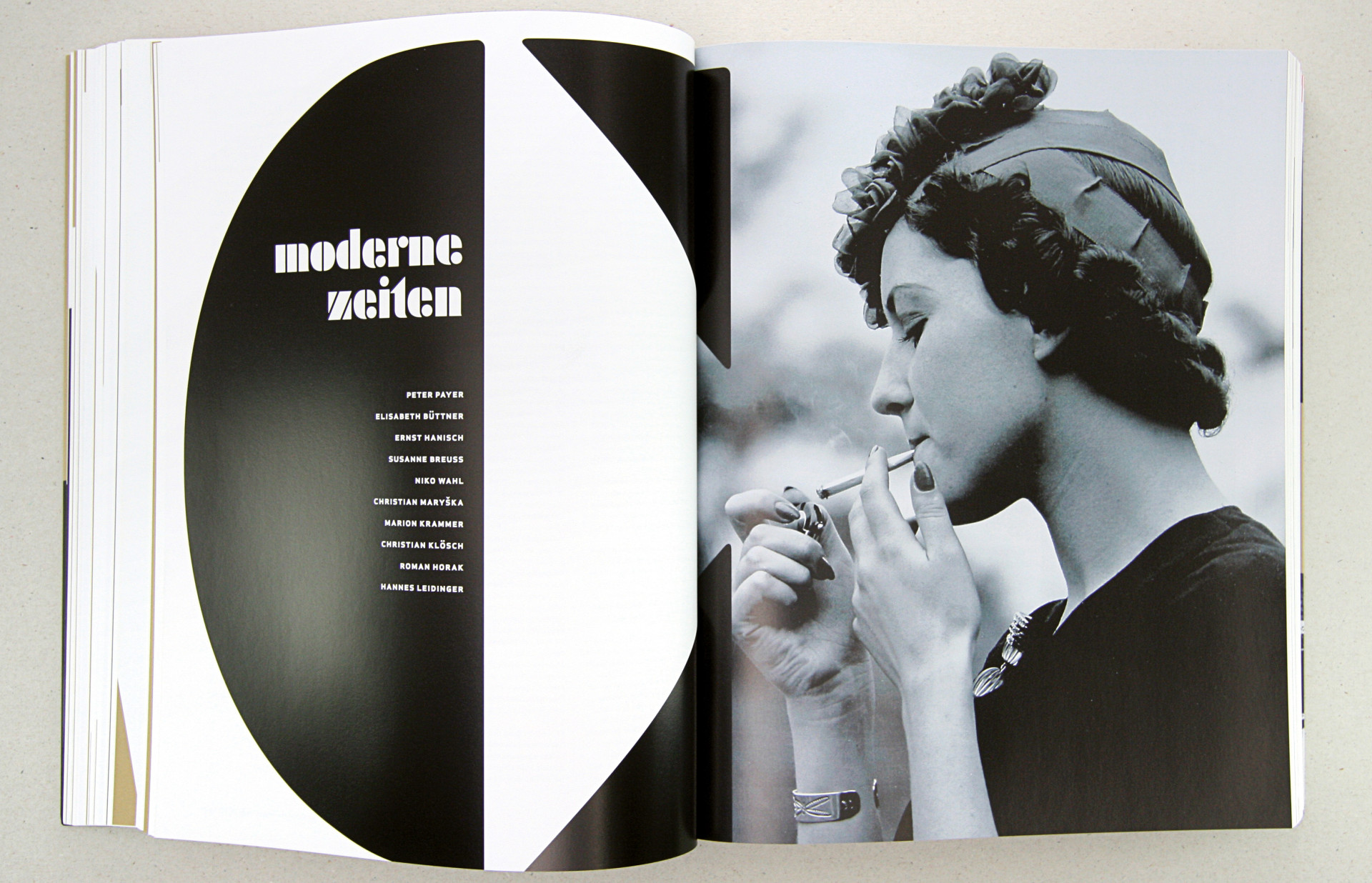
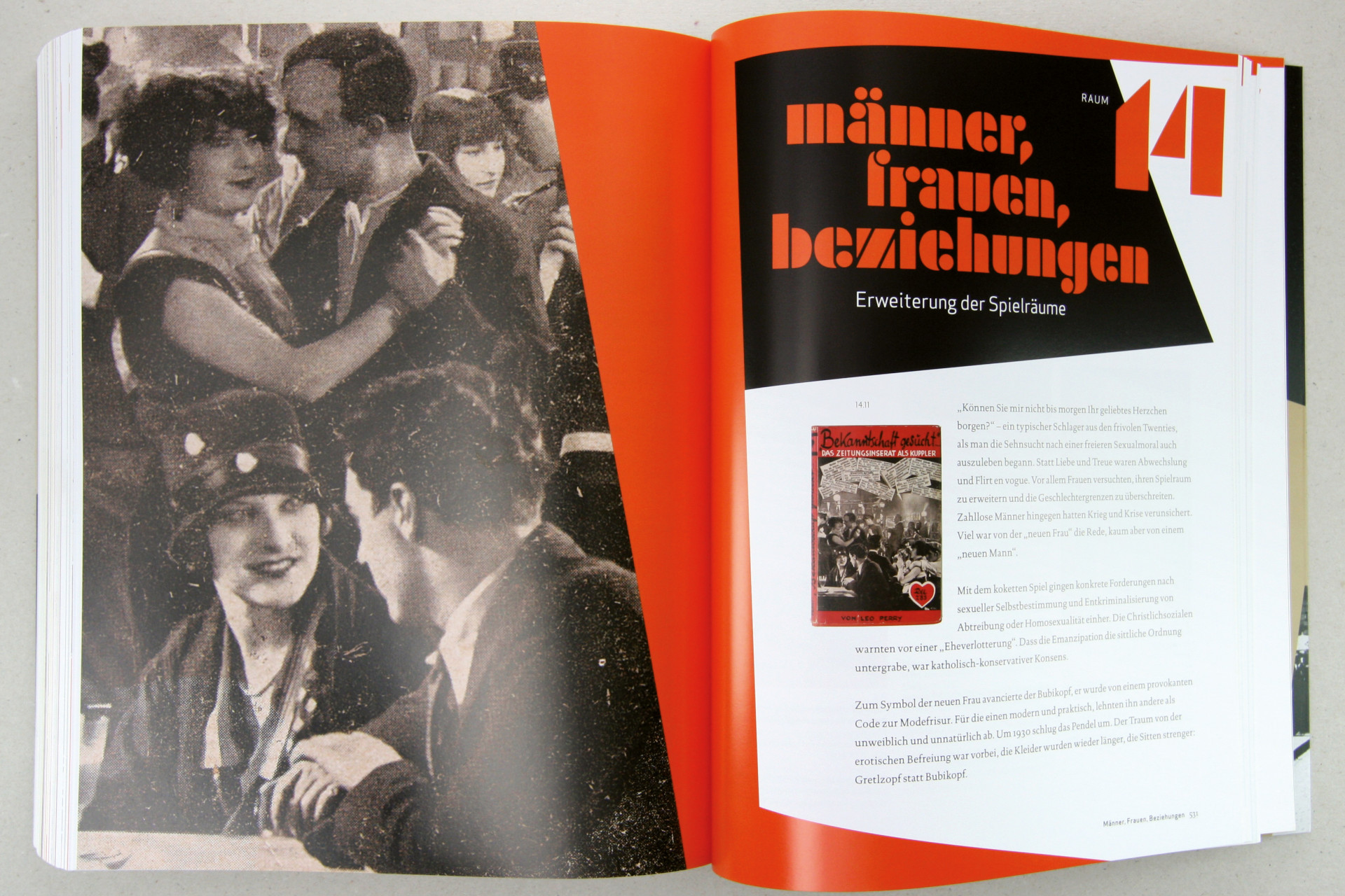
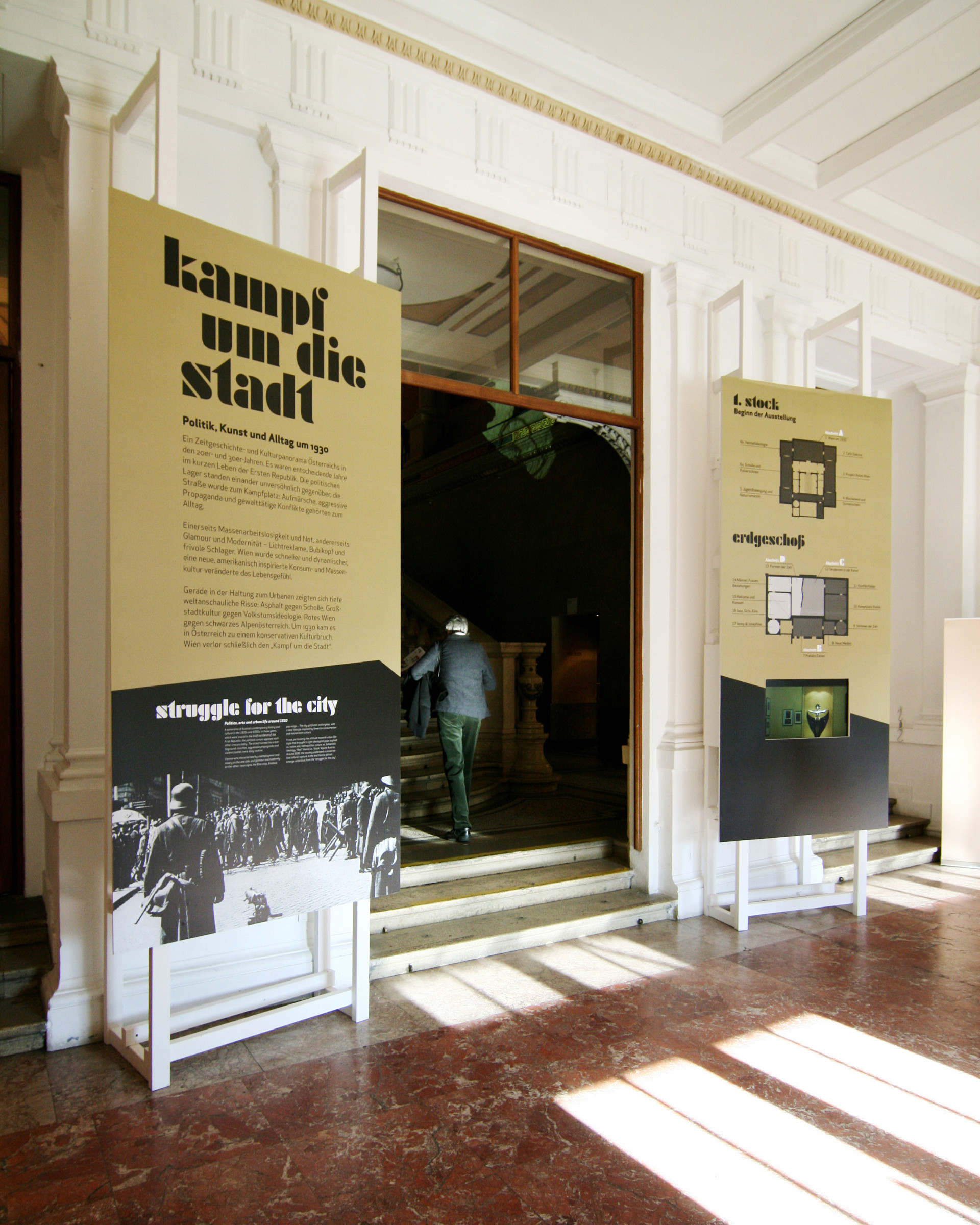
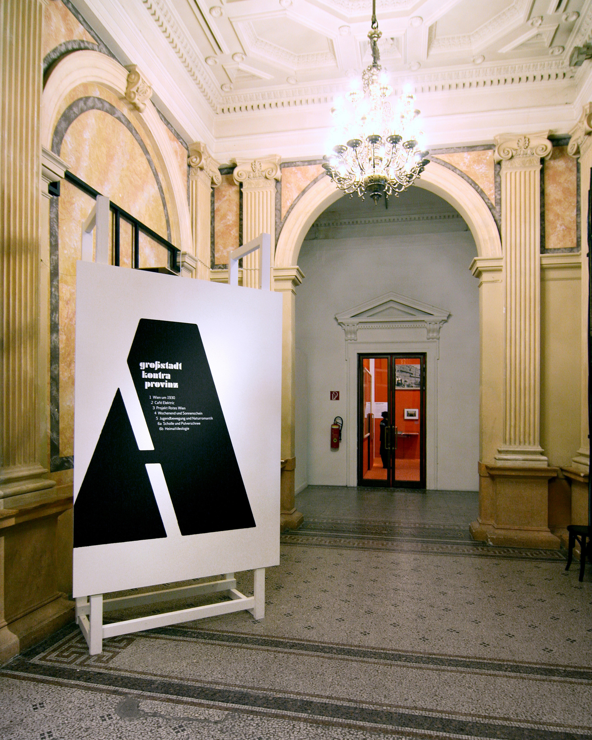
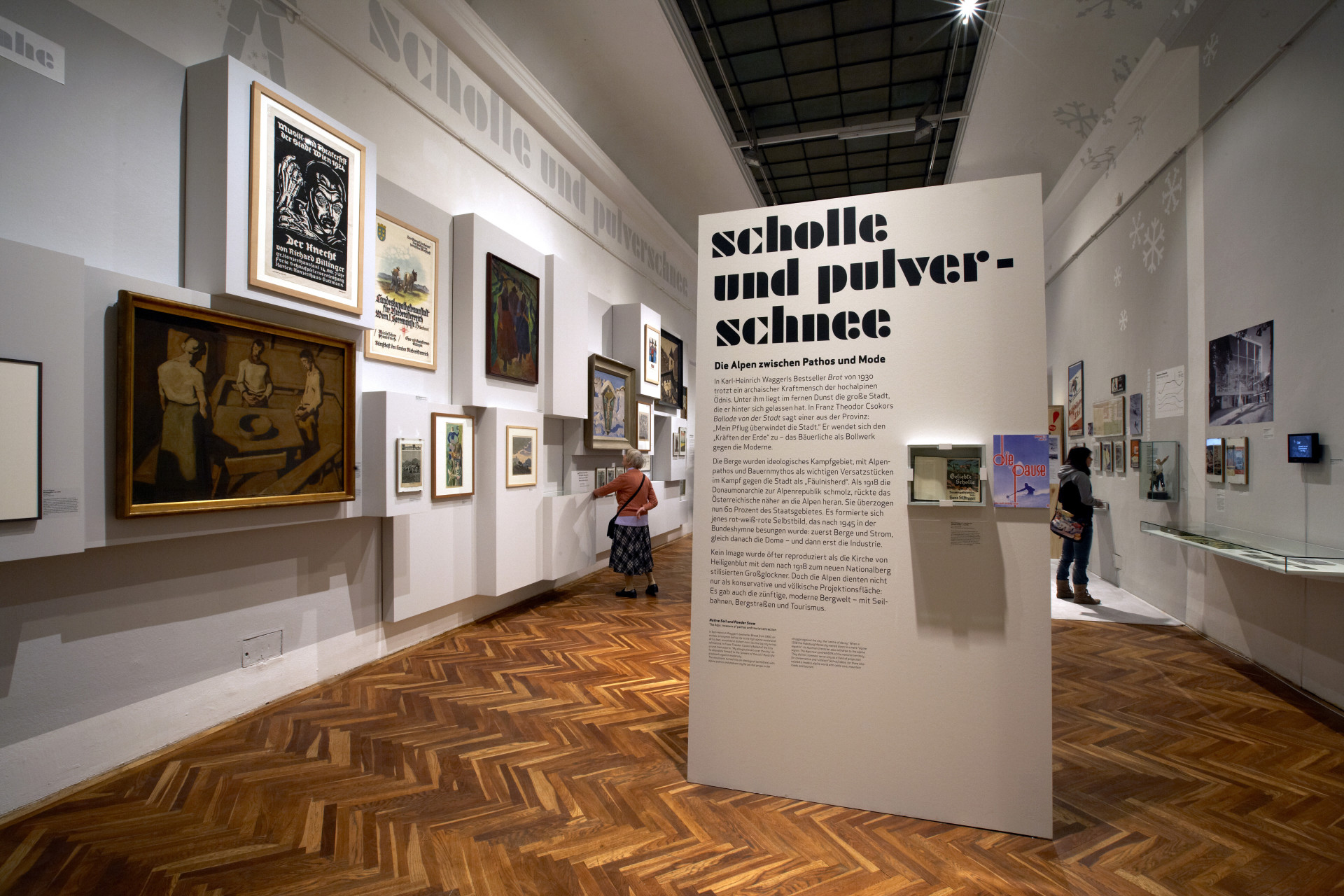
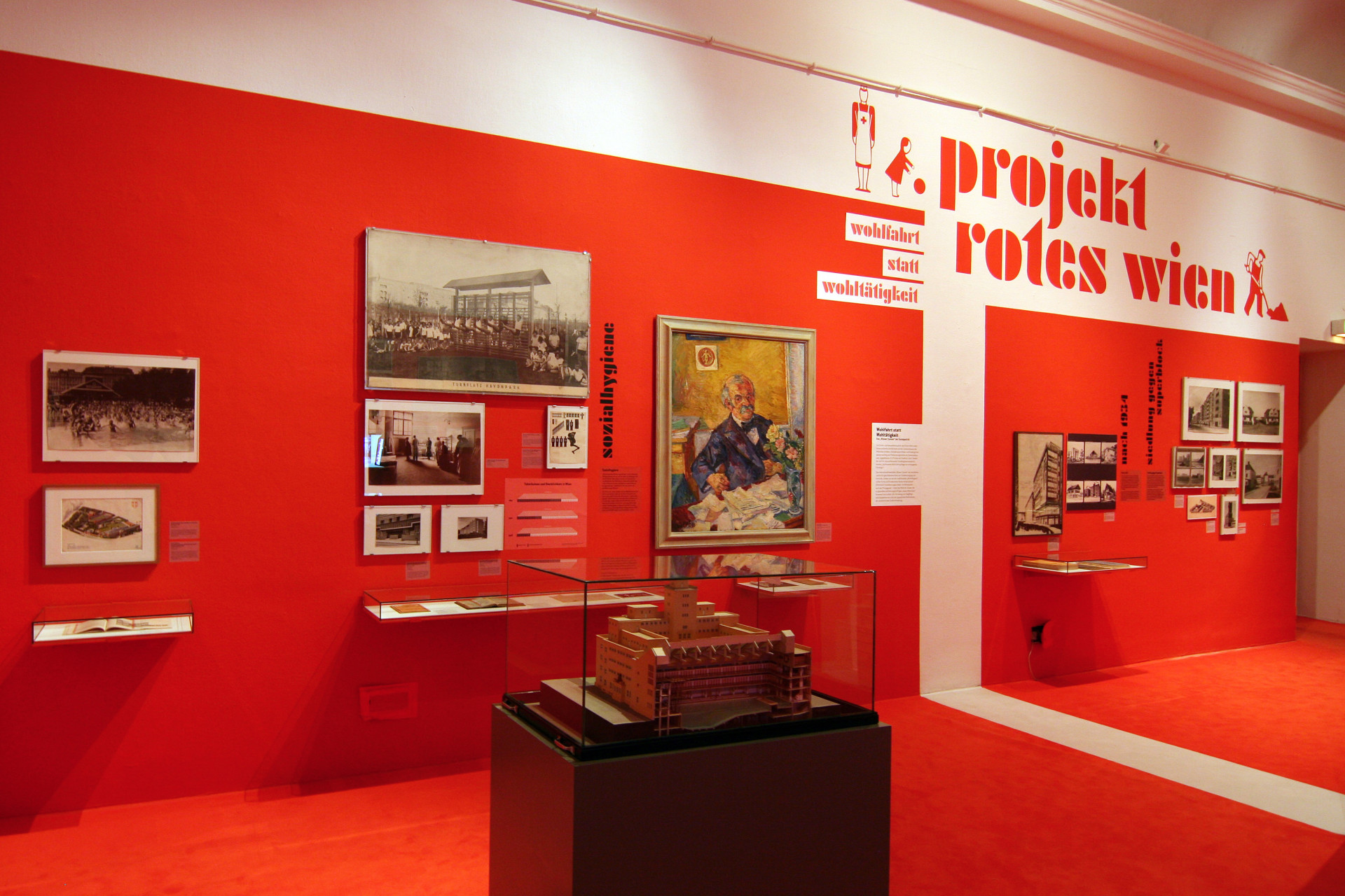
„Fight for the City. Politics, Art and Everyday Life in the 1930s“ was a new kind of exhibition: everyday life events, historical facts and art were combined, and the exhibition design with its the strong typographic character worked as a natural brace. The newly created font, Reklame, gives the exhibition and all media a strong identity. The information design parts of the exhibition referred to the historical Otto Neurath info graphics.