Loading …
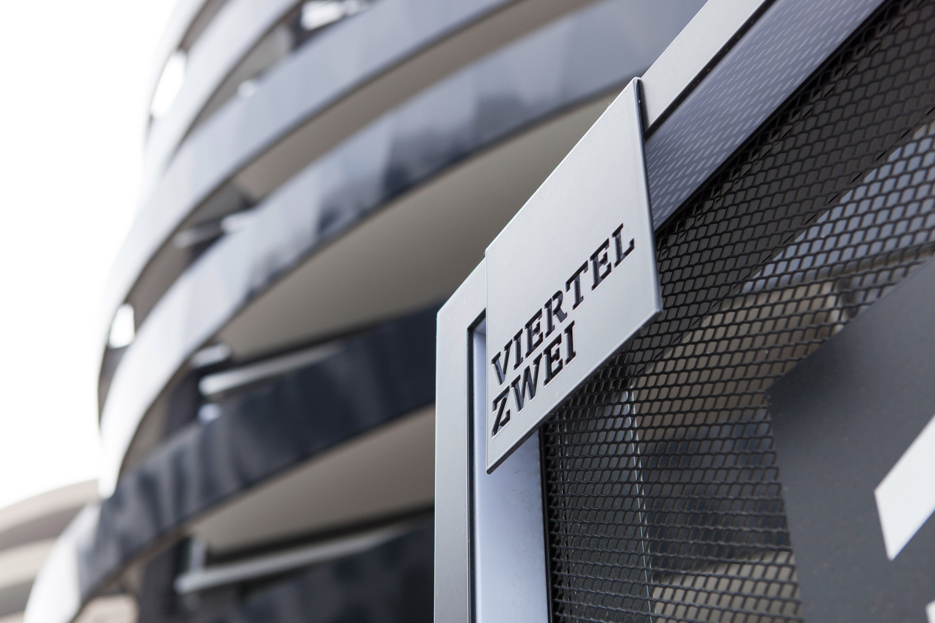
Viertel Zwei
Orientation System
Surrounded by green and yet directly in the city center: The new urban quarter Viertel Zwei – adjunct to the racing court close to the Viennese University of Economics and the subway line U2 – combines work spaces, housing and leisure facilities within a vast complex.
Structuring a new quarter like this with an orientation system requires street names and addresses first. Vivid names, logical arrangements and numberings are the basis to create an open and inviting space. Physical and digital tools support an intuitive and concise orientation likewise. That’s how a functional orientation system helps building a strong spatial identity.
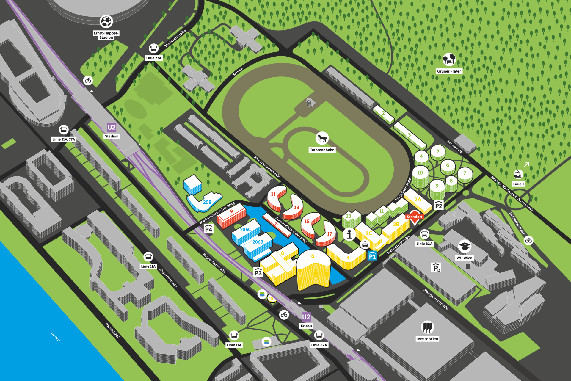
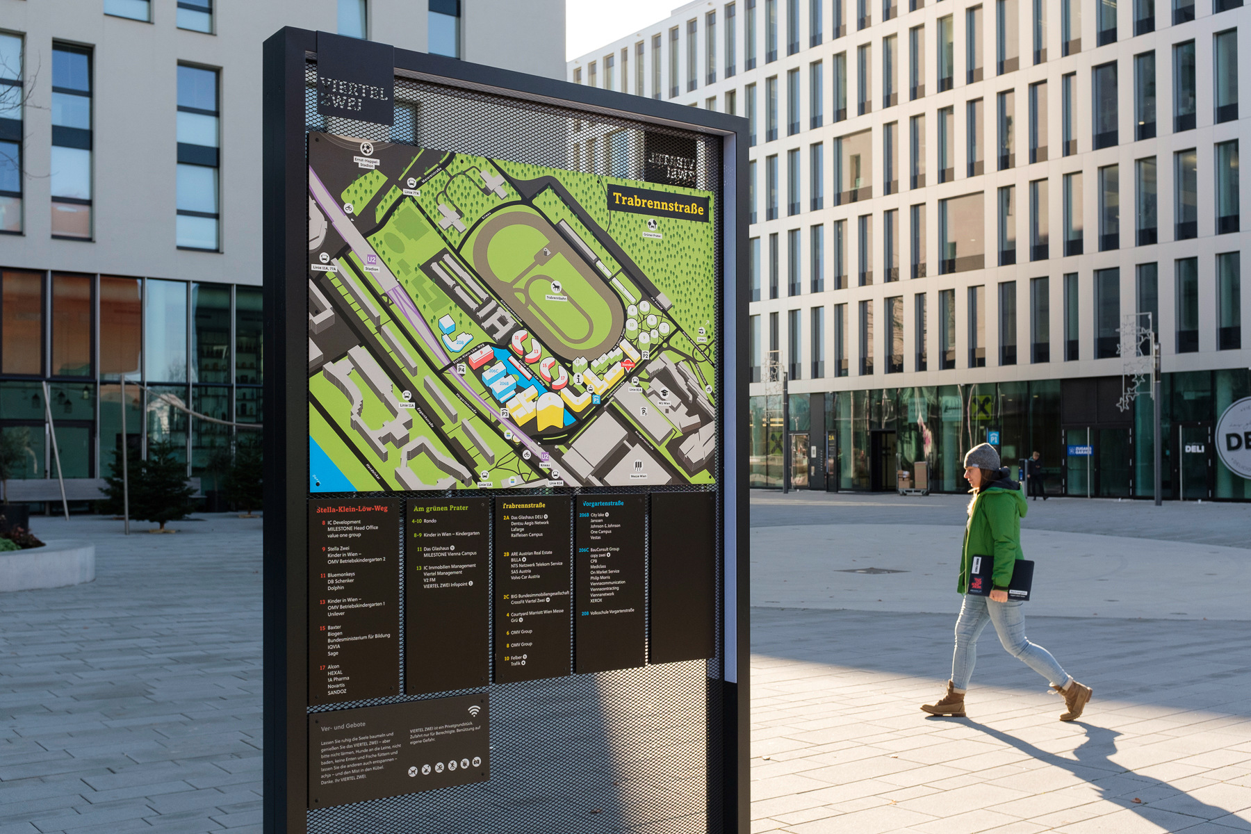
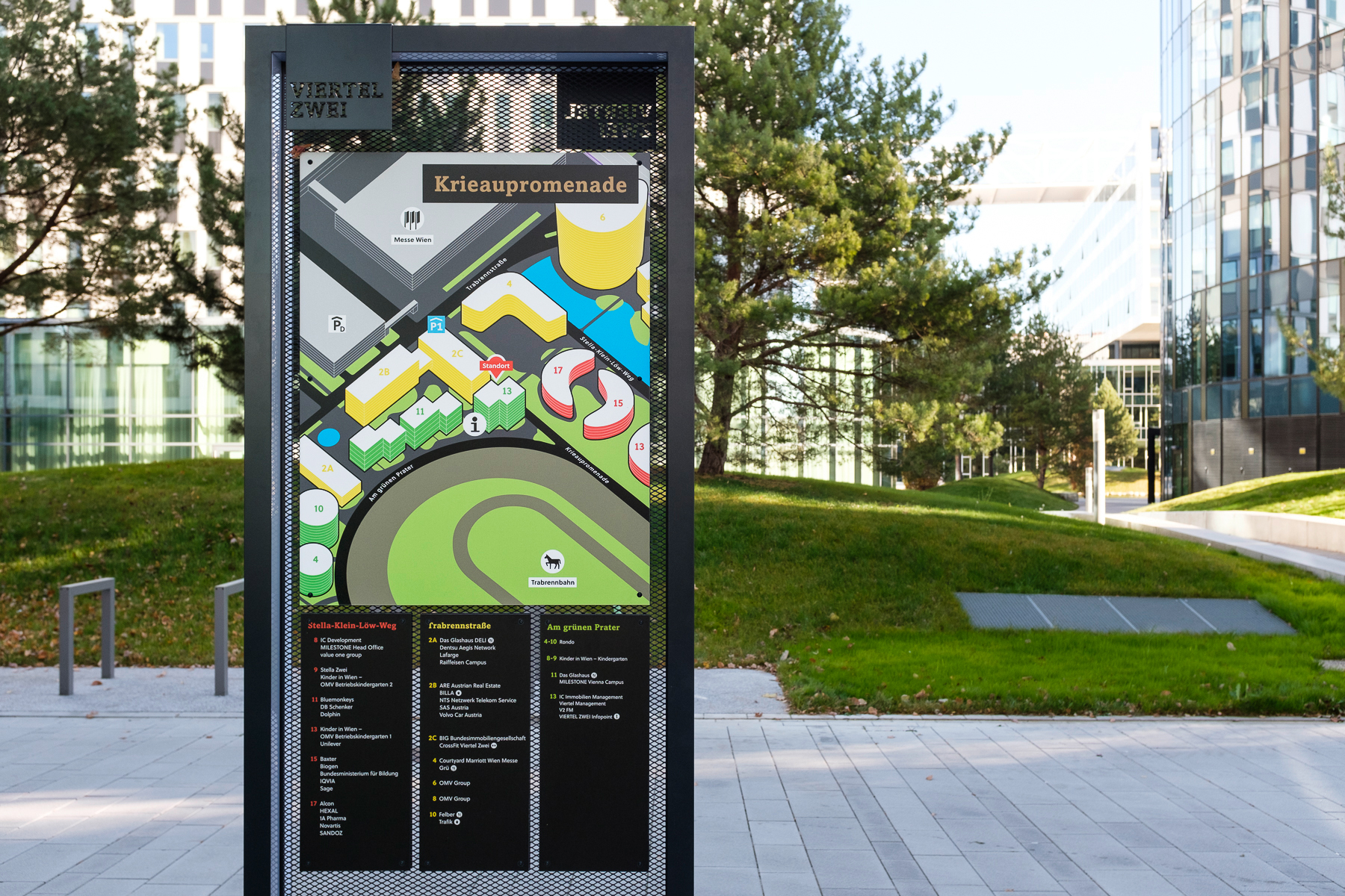
These isometric maps show how green the quarter actually is. The maps turn into the respective walking direction.
Modulares System
Flexible, adaptable and modular: the system was planned for existing as well as future parts of Viertel Zwei. It can be amplified as the new urban quarter grows.
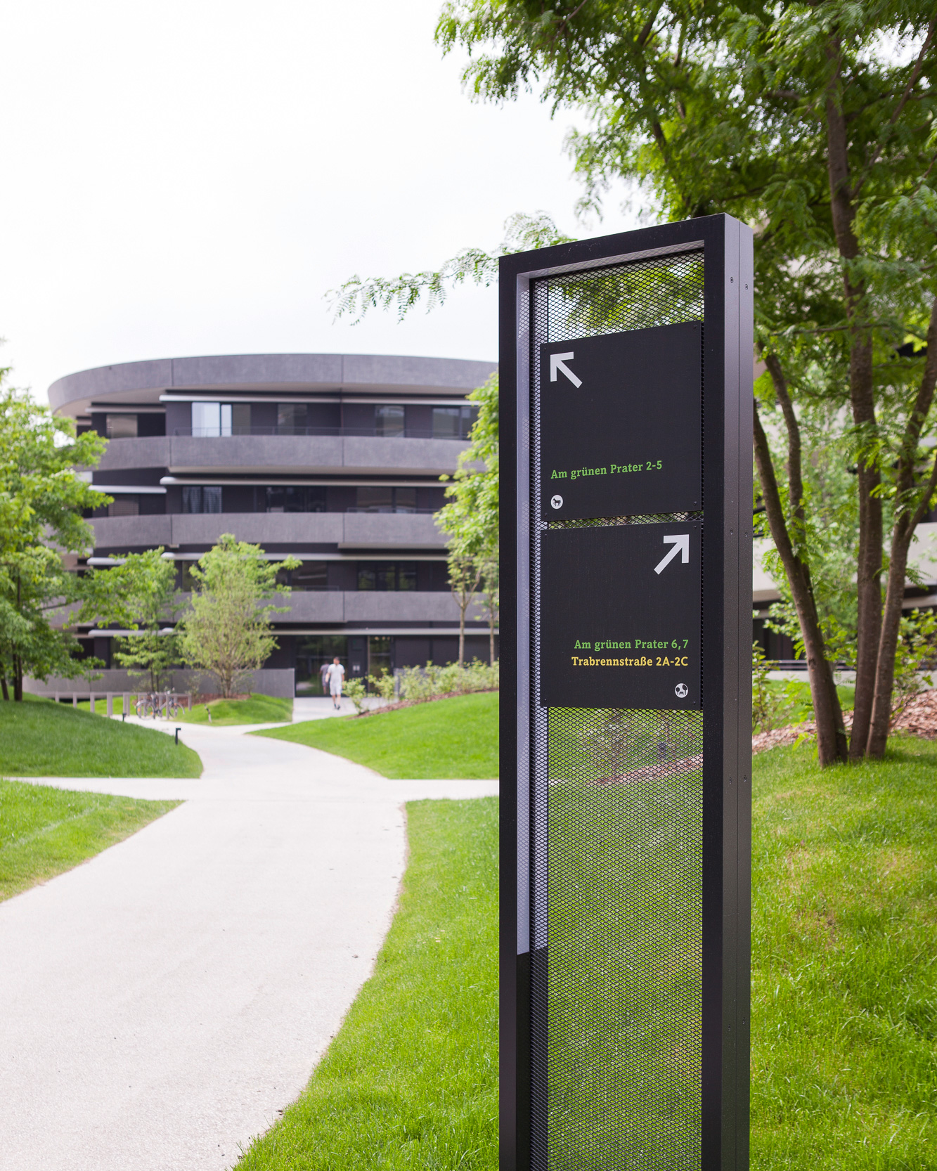
Elegant frame profiles surround the finely woven metal structure of the information carriers. The profiles also leave enough space for a surrounding LED light. By night, it gives the woven metal structure an almost textile character.
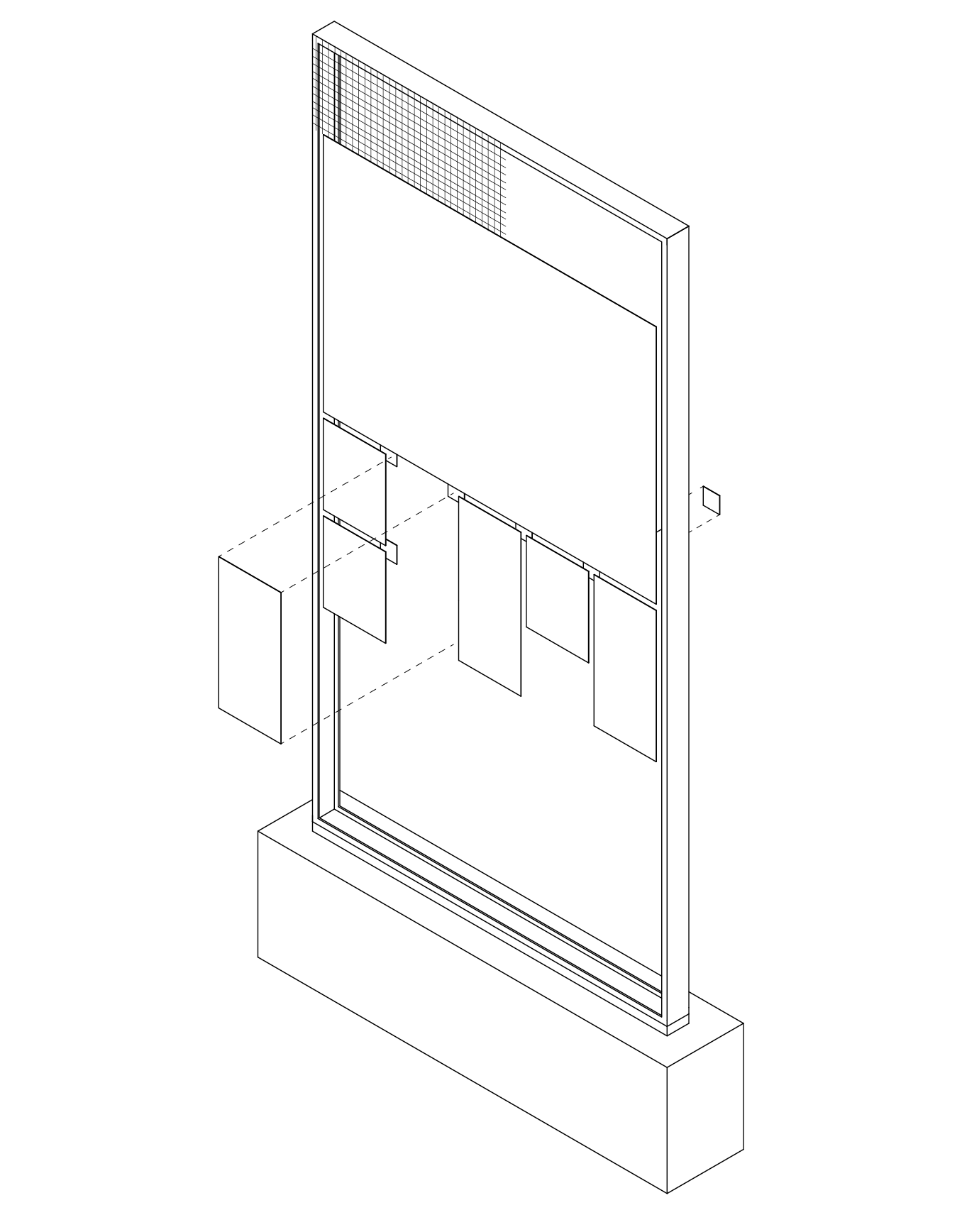

Consistent information carrier family
All elements for route guidance build a consistent family. They guarantee a guided journey to each target location within the quarter by car, public transportation, bike or per pedes.
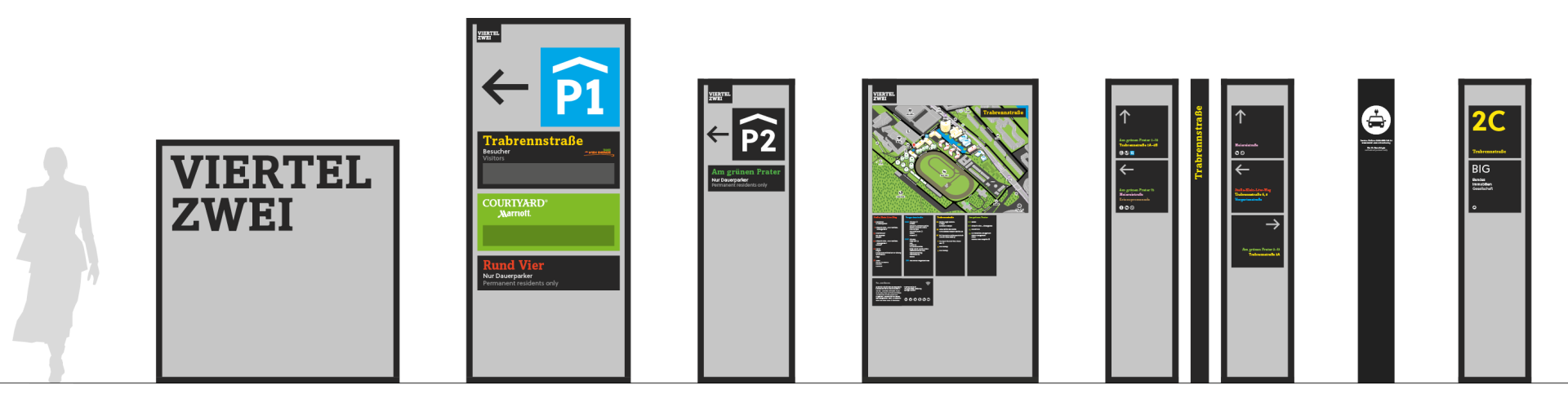
Intuitive colour code
Clustered buildings are grouped through colors and names that are addresses at the same time. The first look immediately tells where a target location is. Direction signs also use these „group colors“, giving the orientation system a lively identity with an elegant touch.


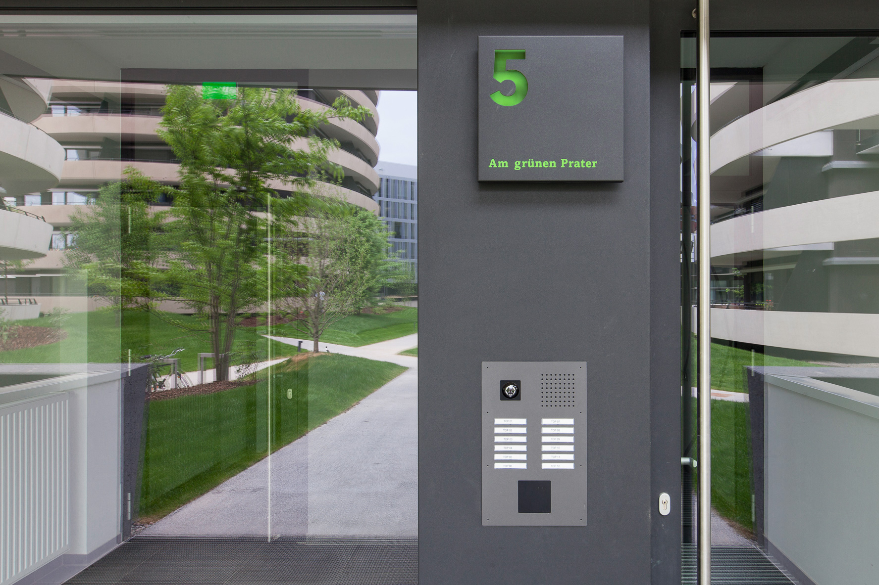
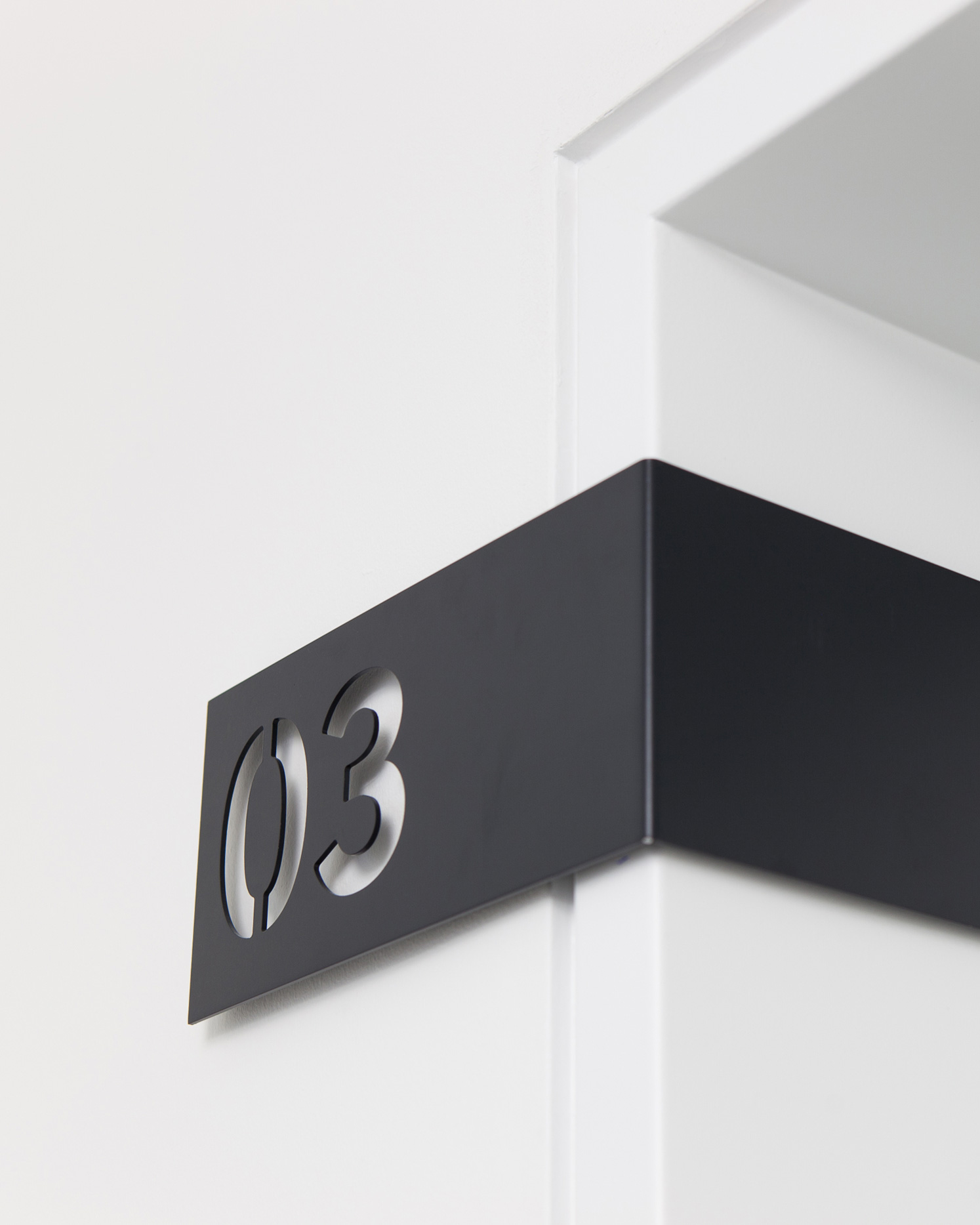
Elegance in the indoor spaces
Inside the buildings, the orientation system concentrates on a minimal features. Simple, reduced yet informative.