Loading …
Vorder Atzberg
Packaging Design
When a good friend is a wine grower and asks you to design a bottle, it’s fortune and challenge at the same time.
Grüner Veltliner – Vorder Atzberg
Tucked high up on the hills in one of Austria’s most famous wine regions, the Wachau, there is a very special vineyard. The site is almost vertical and its small terraces can only be reached through steep stairs. Facing south, the mineral earth gives this unmatched Grüner Veltliner wine its typical aromatic flavor. Still a place of passionate craftmanship, the place dates back to a medieval history of ore mining.
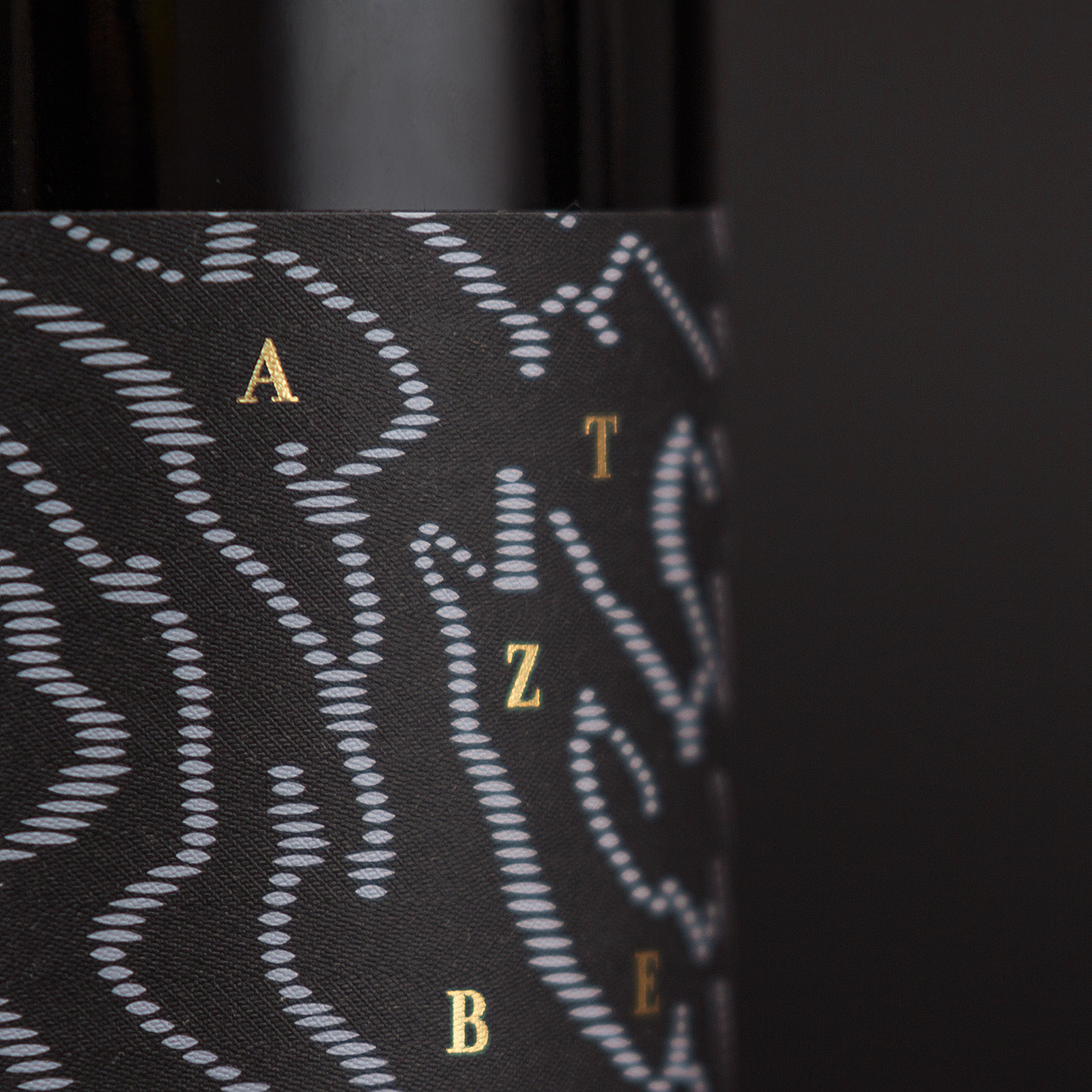
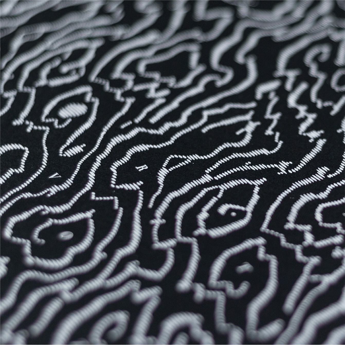
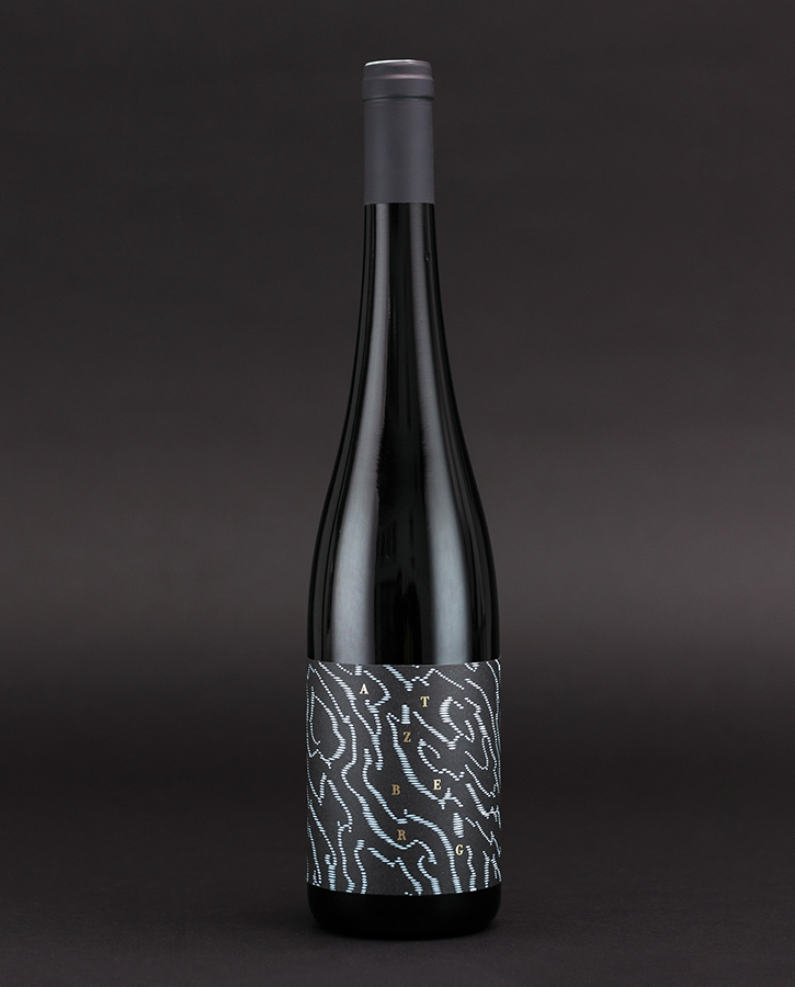
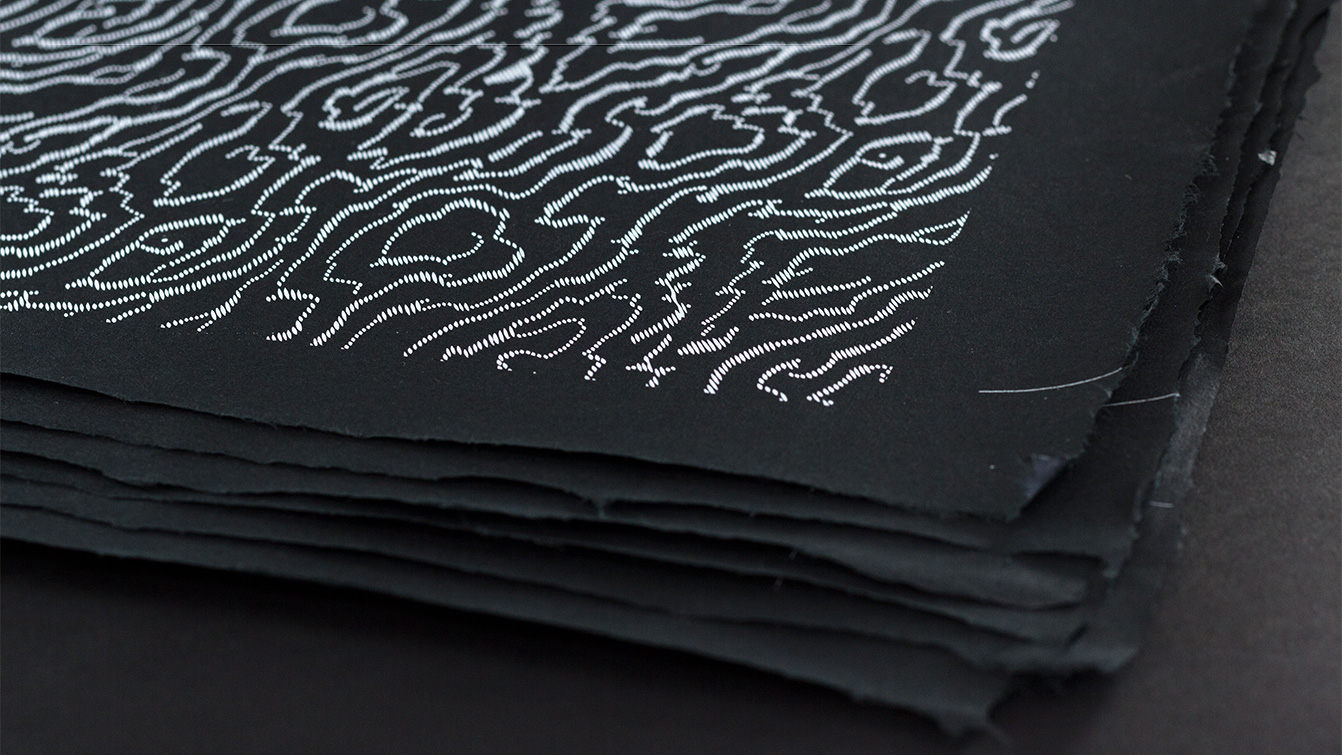
Handcraft is the keyword for the packaging design, too. A first conversation with the winemaker lead to Japanese fabric patterns of the 19th century. Many of them can be found at Vienna’s Museum of Applied Arts. One of them seemed to resemble almost topographic contour lines on a map – just like the different terraces of the vineyard. Once revised and refined, it became the inspiration for the label and the delicate paper wrapping for the bottle. Gold letters point out the uniqueness of this wine. The black, imbued label paper is technologically seen something completely new – combined with a white glaze offset printing and hot foil stamping.
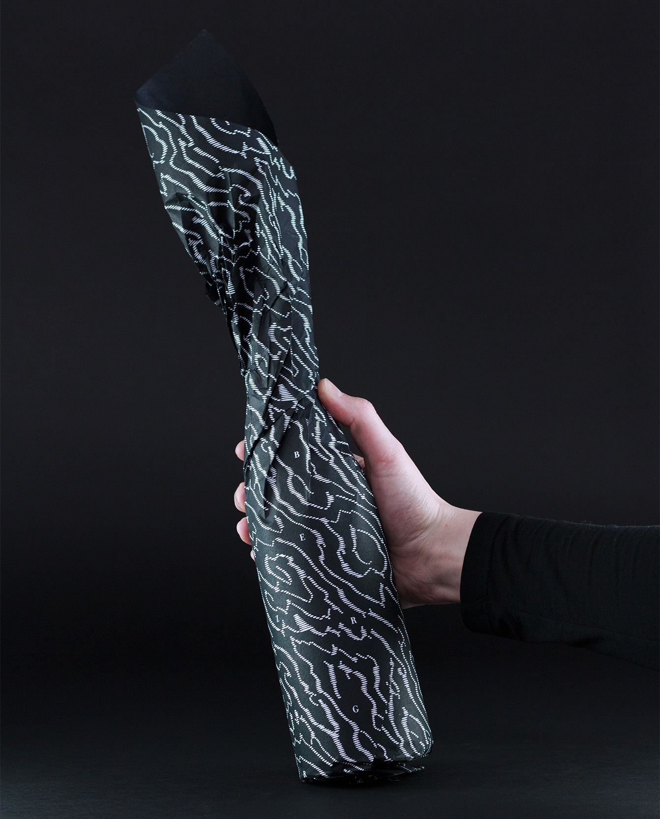
The additional wrapping used the same pattern, printed onto black Japanese washi paper. Structure and typography were turned with the format when wrapped.