How can excellent top-level research and thus the molecular biology research center at the Vienna BioCenter be made better known nationally and internationally? Together with the 450 researchers, post-docs, students and service staff, we started a comprehensive process of organizational development.
What was initially conceived as a relaunch of the brand and communication, quickly developed into a comprehensive repositioning project. The starting point was the architectural redesign of the research building from the entrance to the rooftop café, followed by renaming and rebranding via the website to events and a traveling exhibition with cinema.
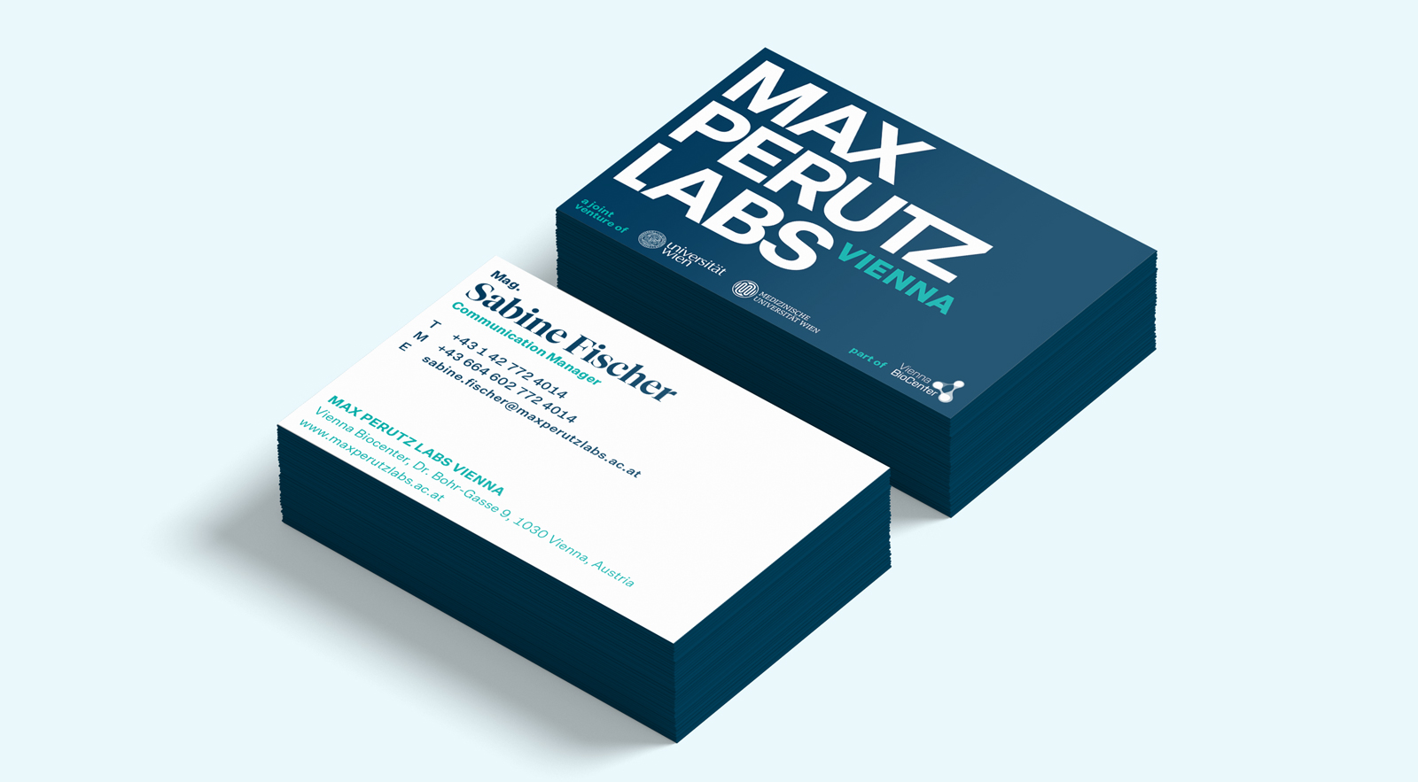
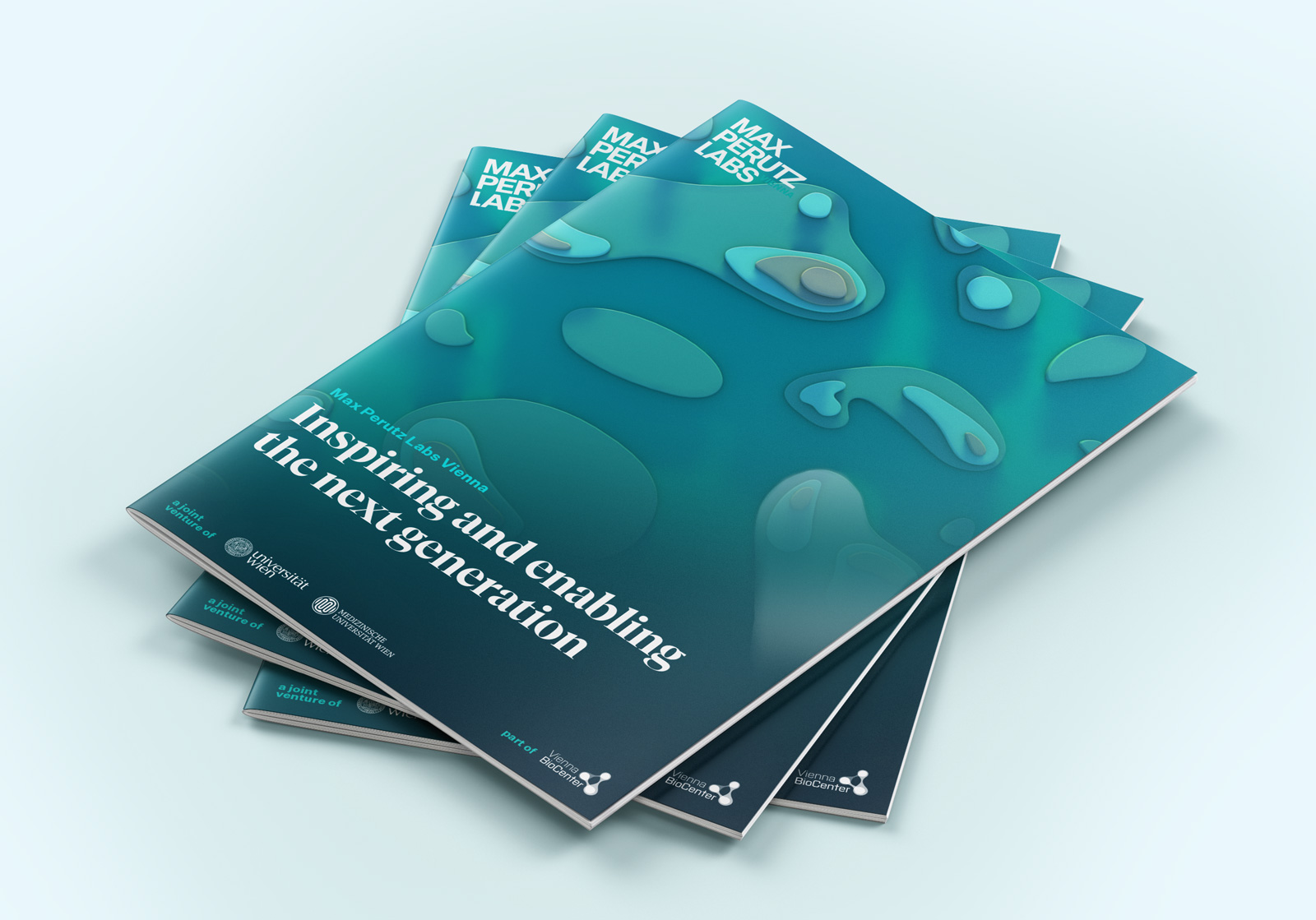
"mfpl" becomes "Max Perutz Labs Vienna"
Our brief analysis of the old logo: complicated abbreviation, long name and difficult to use in the media. With the strategy, we developed precise communication goals and an authentic narrative. The new brand focuses on Max Perutz, who is the name giver the name to the institution. It is self-confidently timeless and, with the addition of “Vienna”, makes the home base and the international claim clear.
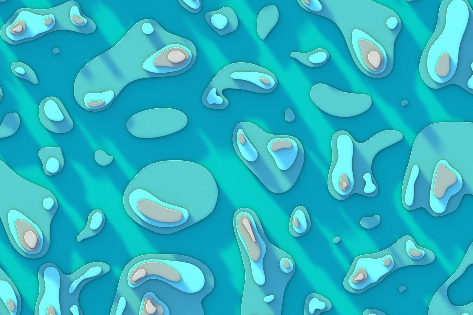
Key visual: Patterson map
The Patterson method maps vectors between atoms instead of their individual positions and is used, among other things, for crystal structure analysis. Max Perutz also used it. Via the Patterson Map, the vectors are always visualized in symmetrical “patterns”.
Photography of image & team
Colorfully staged and photographed directly at the research center, the images set content priorities and clearly stand out from the many generic photos in the scientific world. With over 450 people at the center, the portraits played a special role in team imaging and recognition of good work.
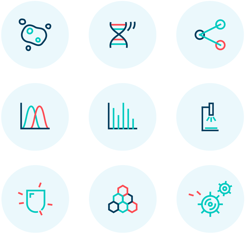
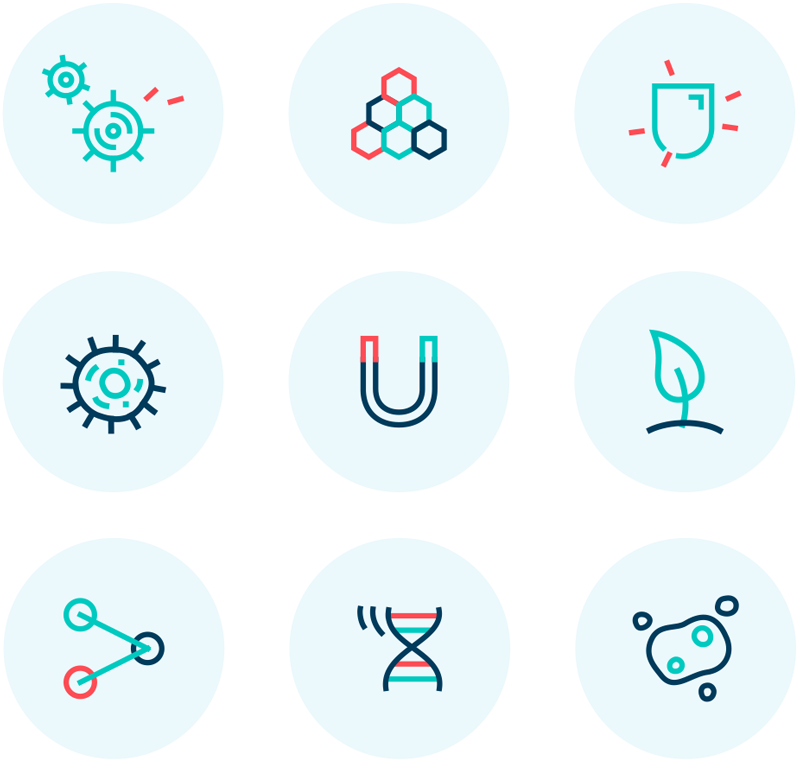
Icons and illustrations
With the strategic realignment, the many research approaches were combined into focal points. Significant icons symbolize them. They are designed as an expandable kit.
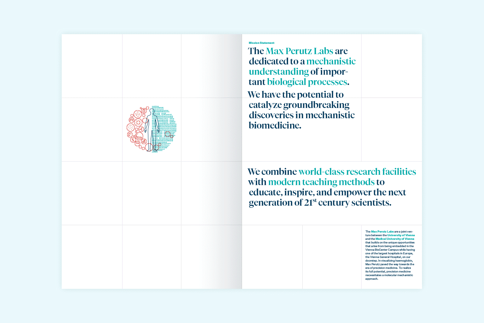
Visual scientific language
The flexible system of colors, typography, design elements, icons and infographics as well as layout principles ensures a clear visual language with scientific connotations. In the often improvised communication environment of the scientific world, a professional appearance clearly stands out.
Narrative & orientation on the homepage
Emotion and reduction were the goals of the new digital presence. With the focus on the personality of Max Perutz, the spirit of the institution becomes directly tangible. An online exhibition leads through his eventful life. Scientific highlights make the diverse approaches of the center’s cutting-edge research easily accessible.
Most of the researchers at the center work in several projects and teams at the same time. The new website provides a better overview and clarity. A permanently usable stage makes searching in research areas and groups easy.
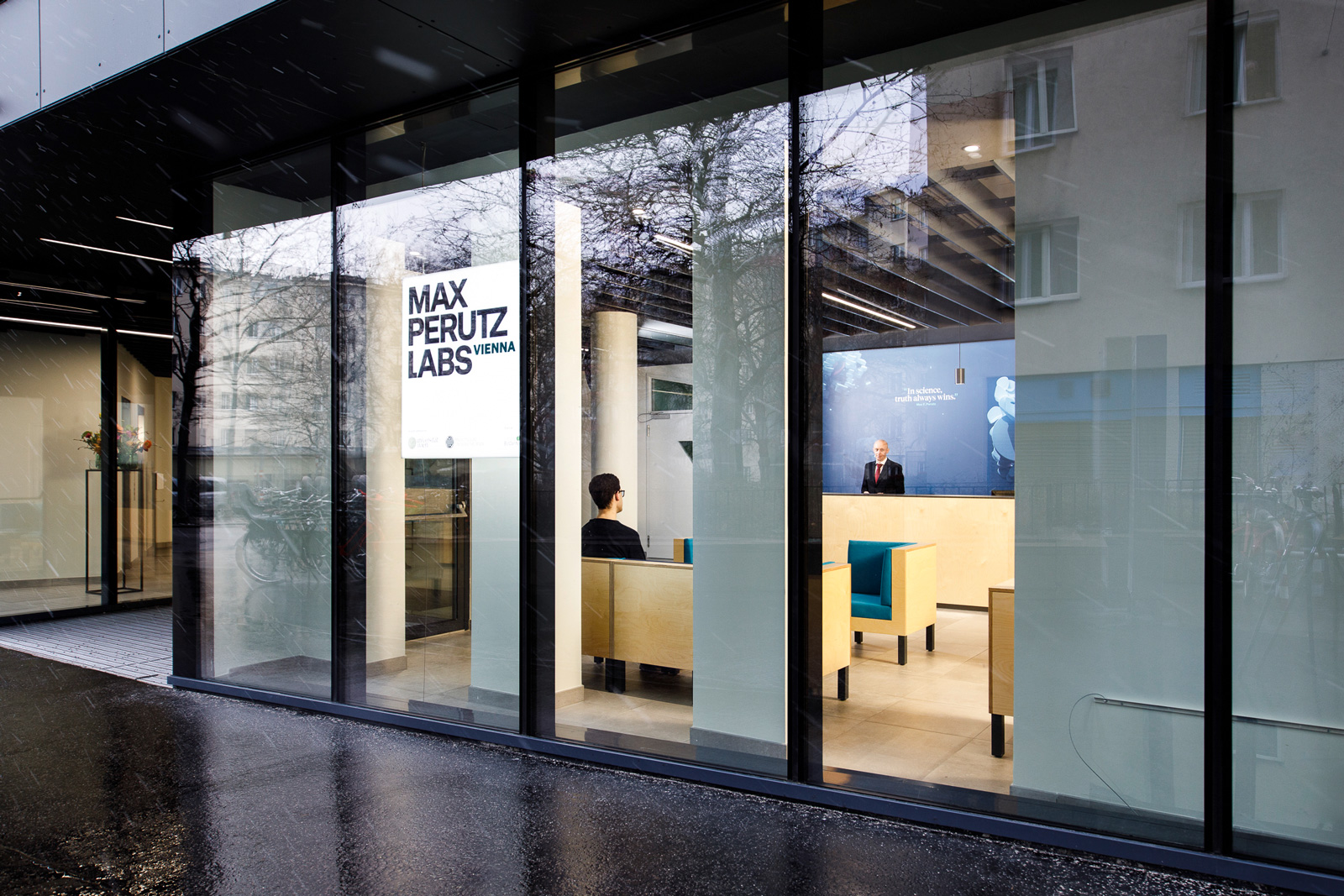
The brand in space
In addition to digital and printed media, the identity is made tangible in architecture through color, typography, surfaces and materials, as well as lighting. The space thus becomes a central communication dimension of the brand.