Loading …
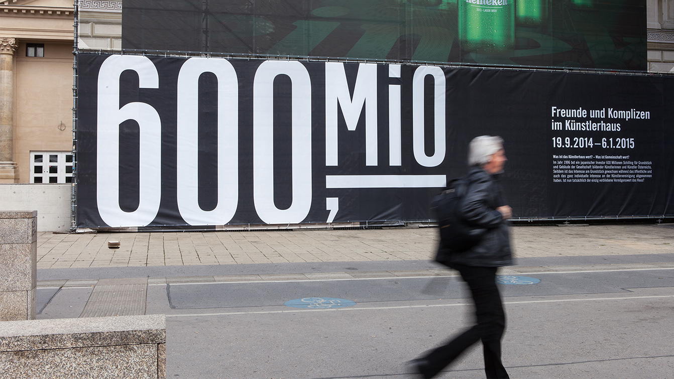
Künstlerhaus: 600 Mio.
Exhibition Design, Communication Design
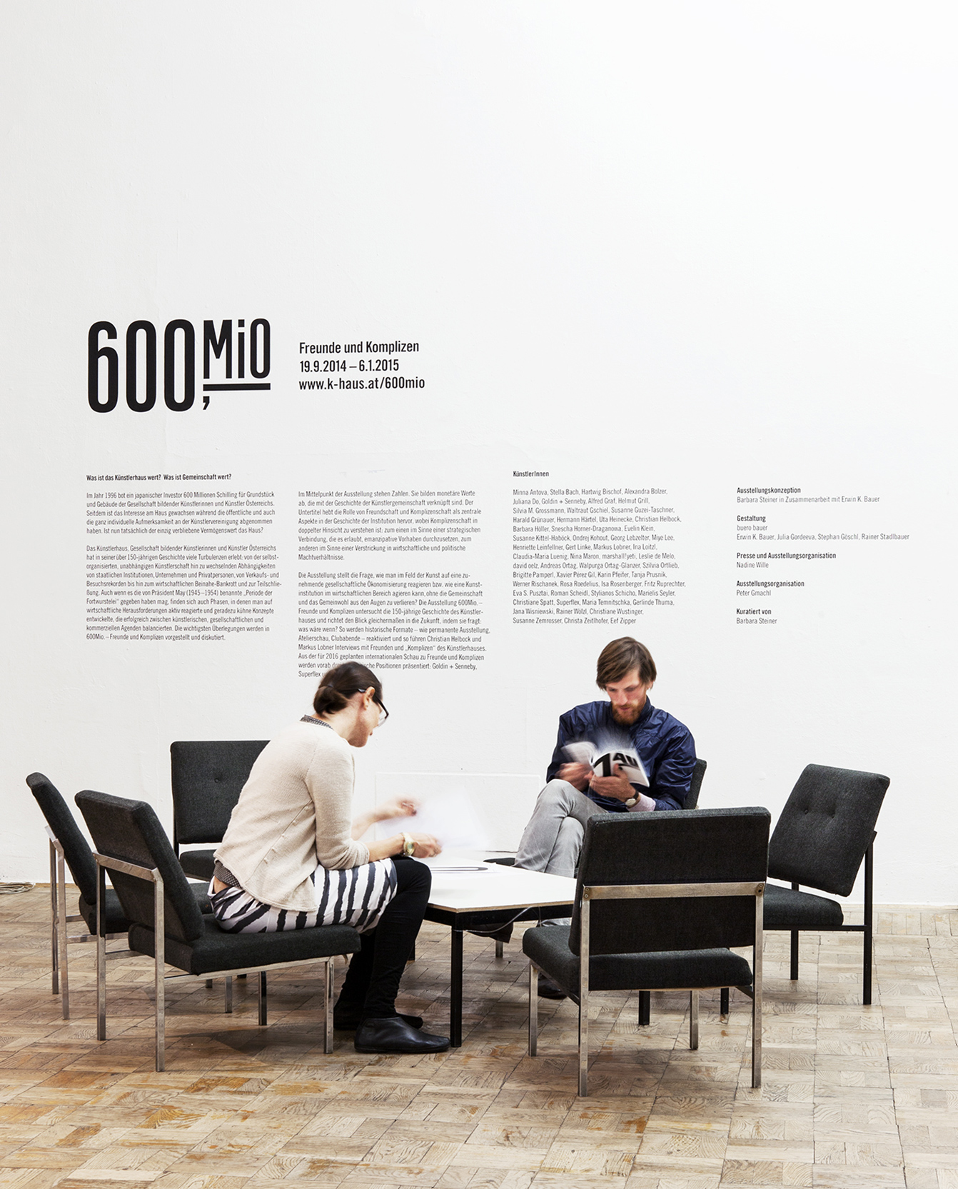
An exhibition at Vienna’s Künstlerhaus that was called “600 Millions” – referring to the amount of money an investor was willing to pay for the whole museum back in the 1970s. Numbers of all kinds were the consequent key to the exhibition design.
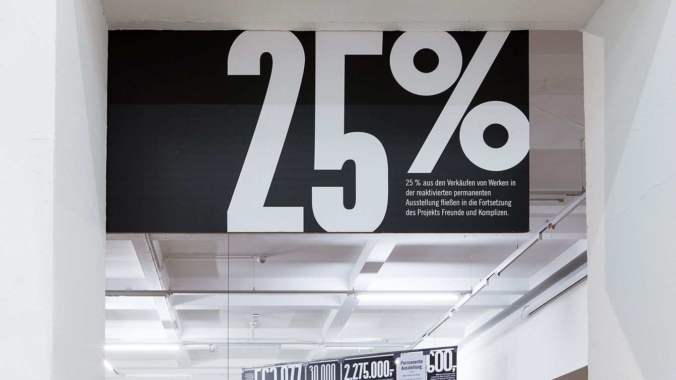
The exhibition shows what kind of witty strategies a museum needs to develop to deal with varying financial situations: the juggling between record visitior numbers and uncertain conditions. Consequently, the exhibition tells the history of the Vienna Künstlerhaus Museum strictly through numbers – both, on the exhibition display as well as through the communication media, like a catalogue or the accompanying website.
Central element of the exhibition concept was a room-filling display, made of 23 single cardboard elements. Each back side is equipped with an art work – the front side informs about it through numbers and their meaning. Numbers are the guiding element through the whole exhibition, always explaining different objects and their monetary component. A mirror wall literally showed interviews projecting videos on the back side, therefore becoming location of reproduction and perception likewise.
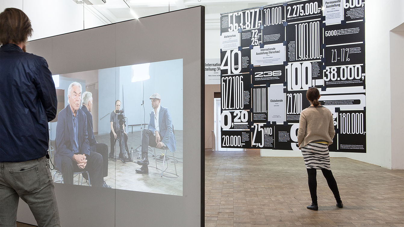
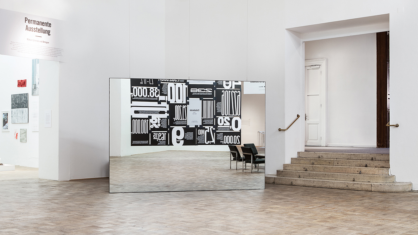
Artists Christian Helbock and Markus Lobner installed a mirror wall in the central hall. Interviews, that they had been filming before with people from the museum, were projected on the back side of the wall later. The screen is a place of reproduction and reception like wise.
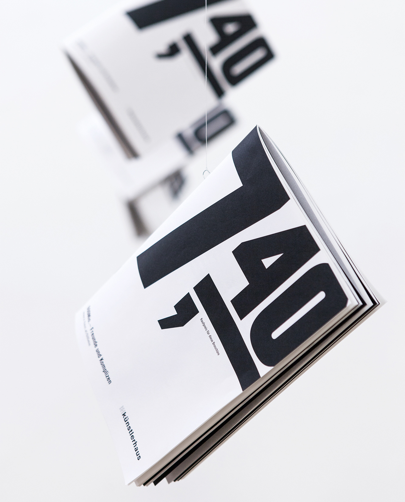
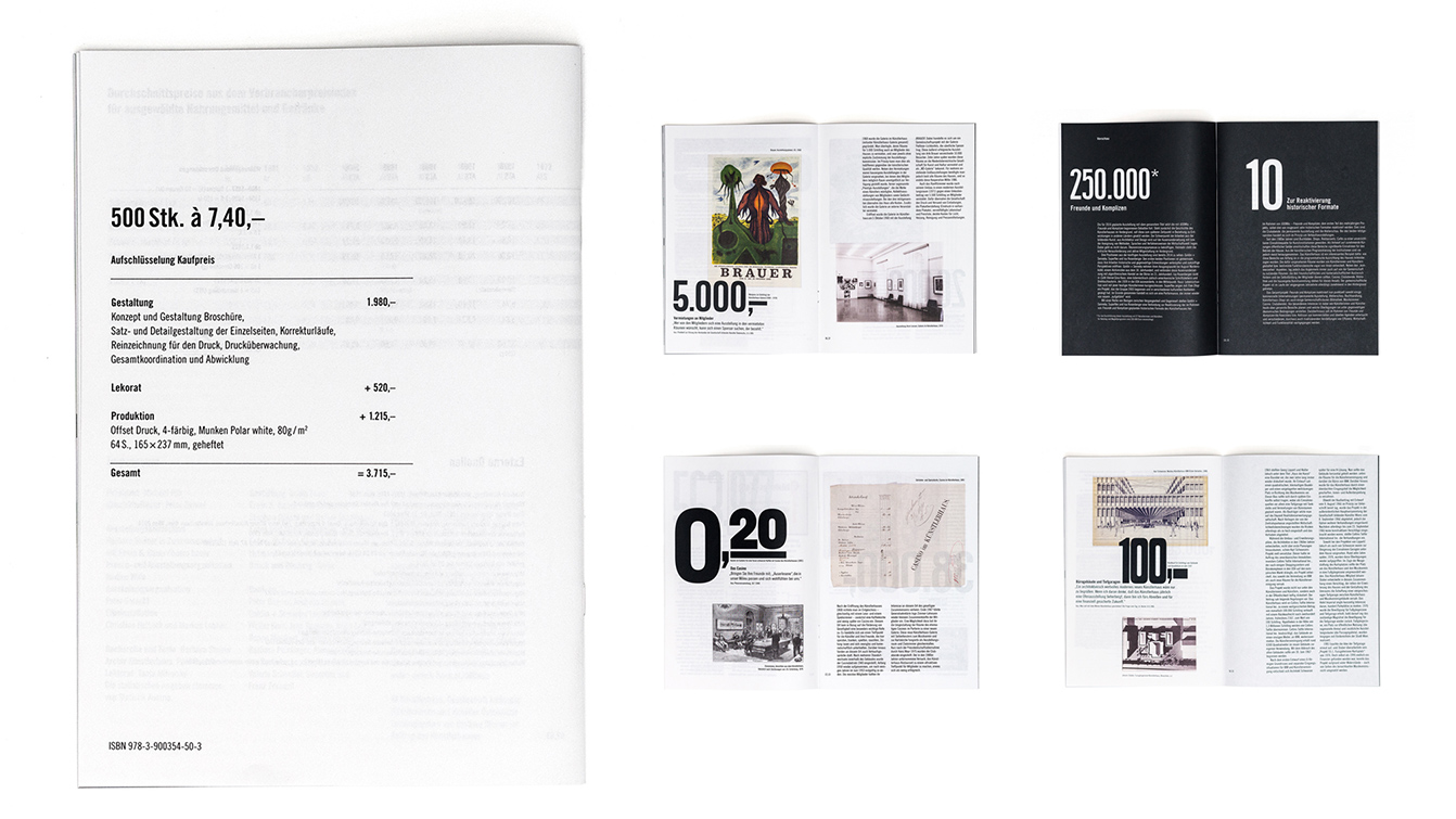
Thought consequently, the catalogue itself is an example and object within the exhibition. The cover tells you its actual production price, € 7.4.The back side reveals all the single positions which contribute to the pricing, from design to printing..
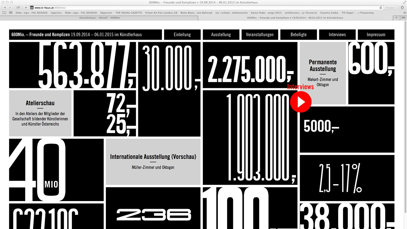
The identity of the exhibition also included the web design of the accompanying homepage www.freundeundkomplizen.org