Loading …

Heuer

Identity, Packaging Design & Website

Vienna’s Karlsplatz is one the loudest & most frequented arteries in the city. In the middle of several roads, there is a small green space with an iconic cubic building: the second location of the exhibition space for contemporary art, Kunsthalle. Its adjunct café had changed owners, with the new ones aiming to turn this difficult place not only into a hip culinary hotspot – but also into a neighbourhood garden.

Duality as design principle
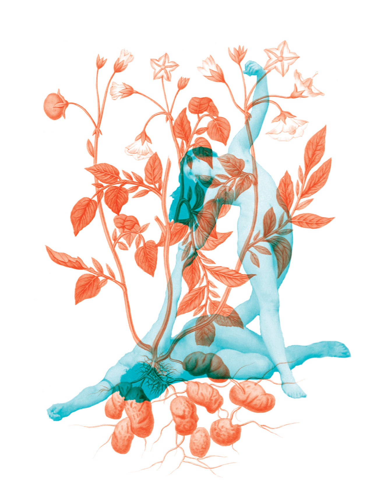
To visualize this new urban oasis, a sensual design concept came into being. The visual appearance reminds of old paintings and creates an extensive illustrative world. The design also emphasizes the transition between day and night operation, and therefore the change from café/restaurant to bar hours. The illustrations change from being nourishing & lush to intoxicant & sensual. The colors red & blue support this duality and turn the whole corporate identity into a magical parallel universe. As the surrounding gardens were growing, the new concept fulfilled its promise to be a new lively place.
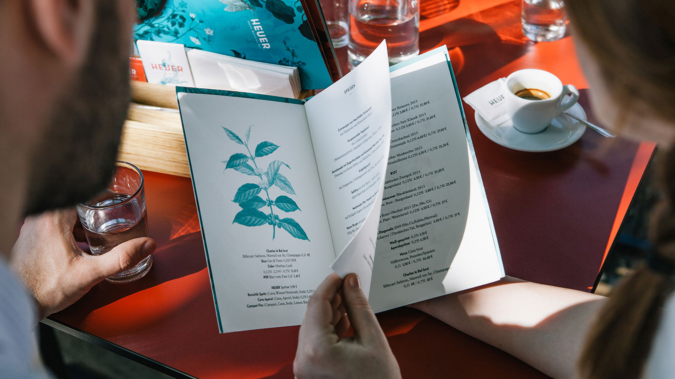
Two people photographed from behind looking at a menu sitting at a restaurant table
Logo with claim as subtitle: Heuer. Garden. Restaurant. Bar
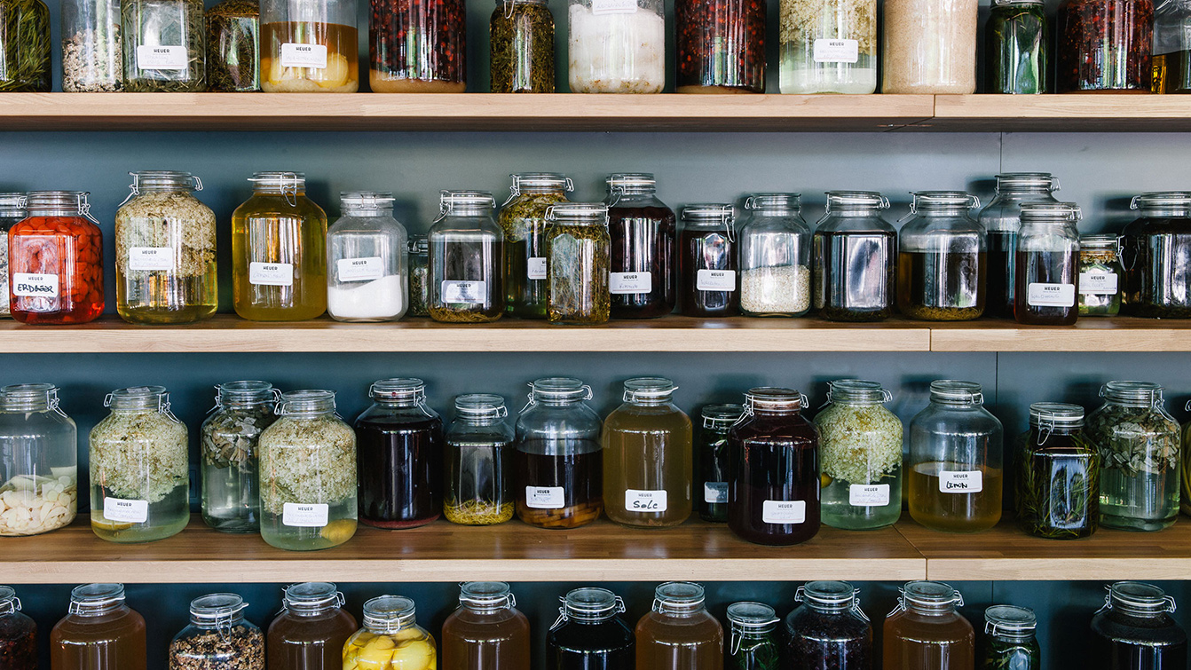
Storage shelf with many preserving jars and labels that serves as a wall decoration in the restaurant
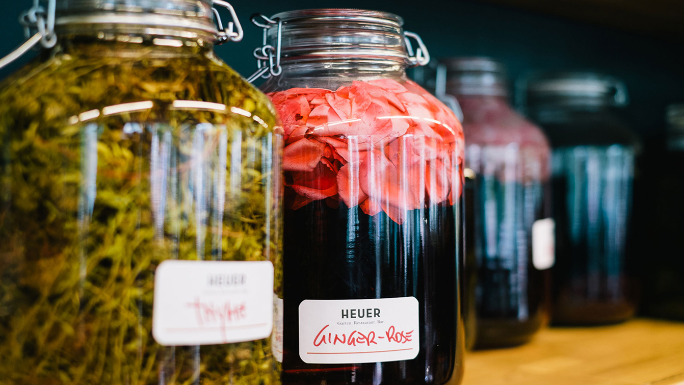
Close-up of filled storage jars with the in-house labels
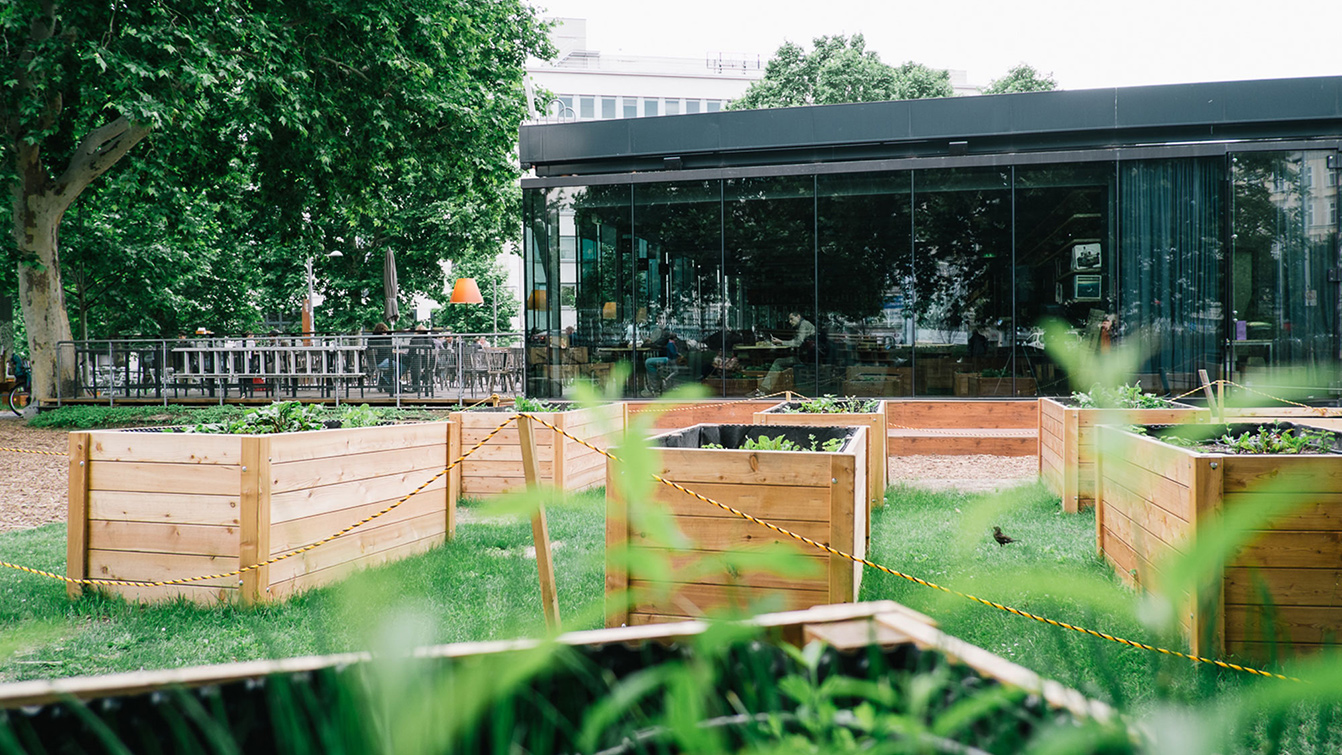
Shot of the restaurant garden with raised farming beds
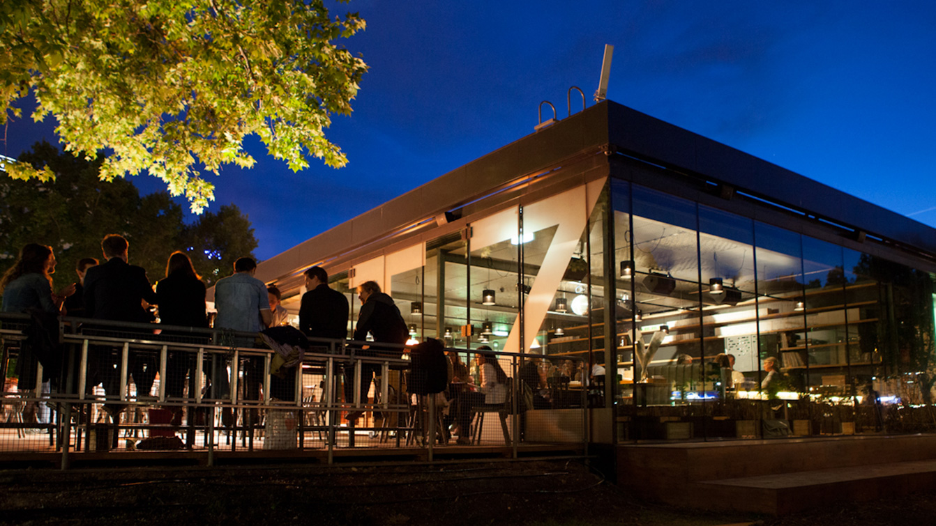
Night view of the restaurant and its luminous glass cube architecture
View of the site changing color from red to turquoise between day and night operation from restaurant to bar
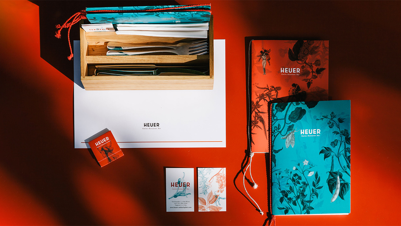
All printed media of the Heuer at a glance with menu cards, business cards, igniters, etc.
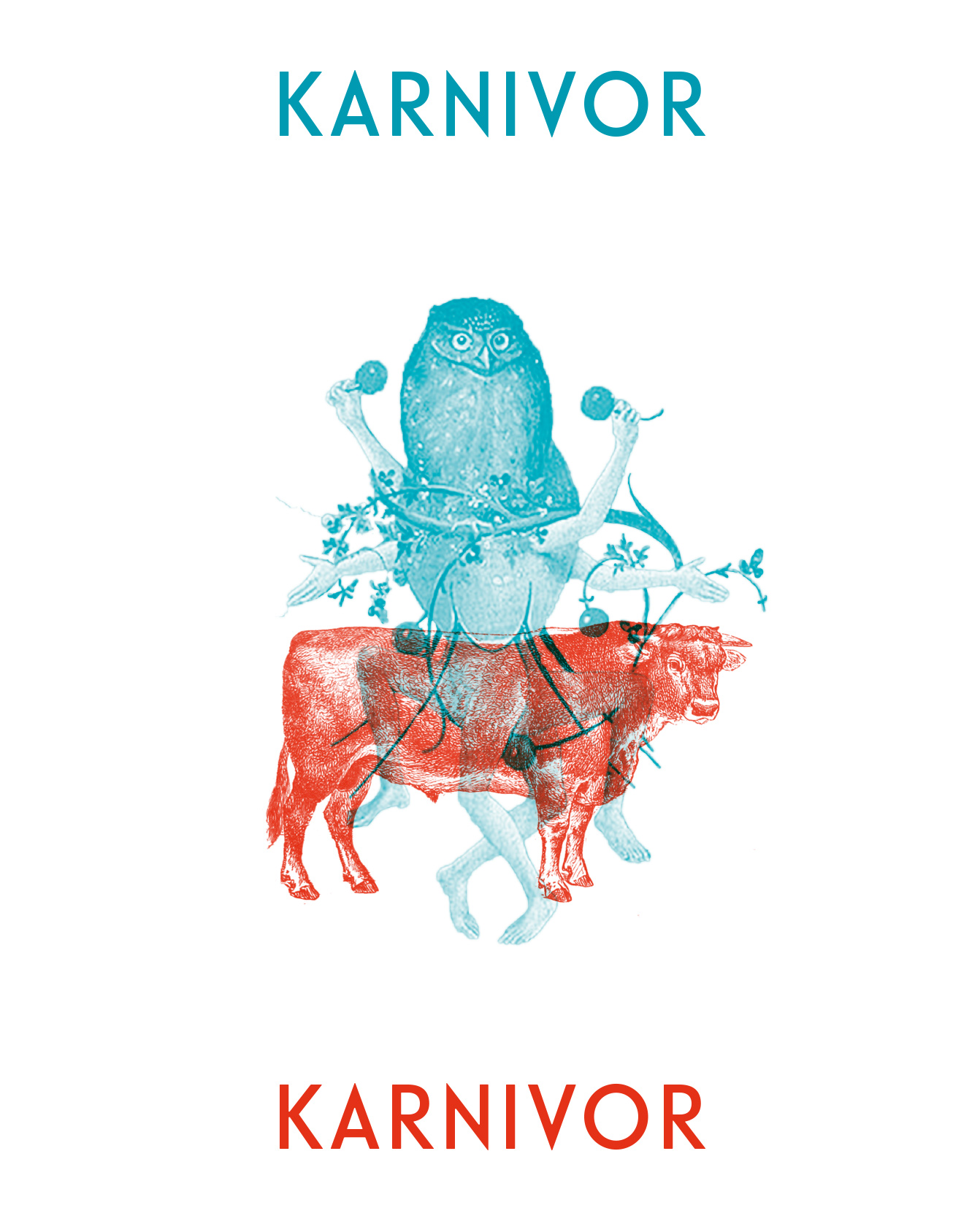
The dualistic illustration world as an example with overlapping elements in red and turquoise
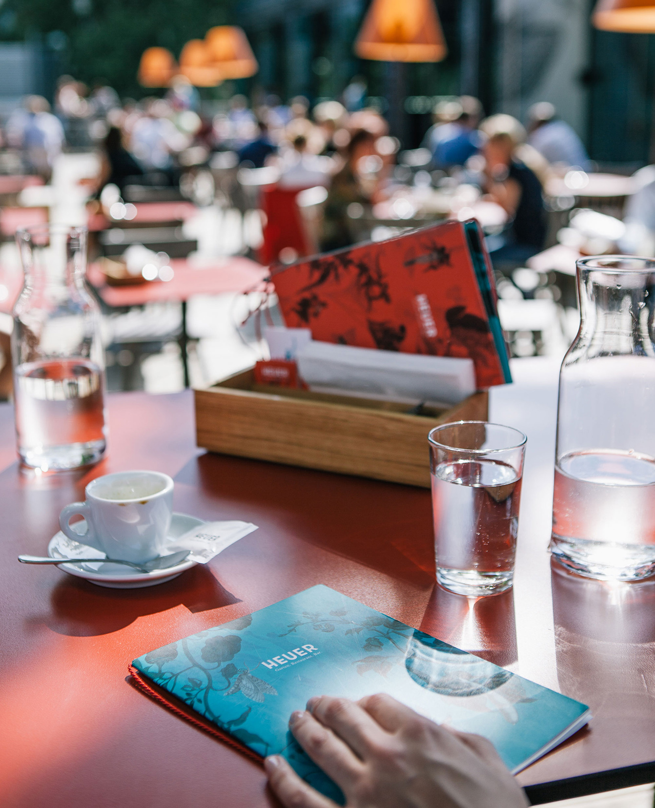
View of restuarant table with menu card and water glasses, people in background
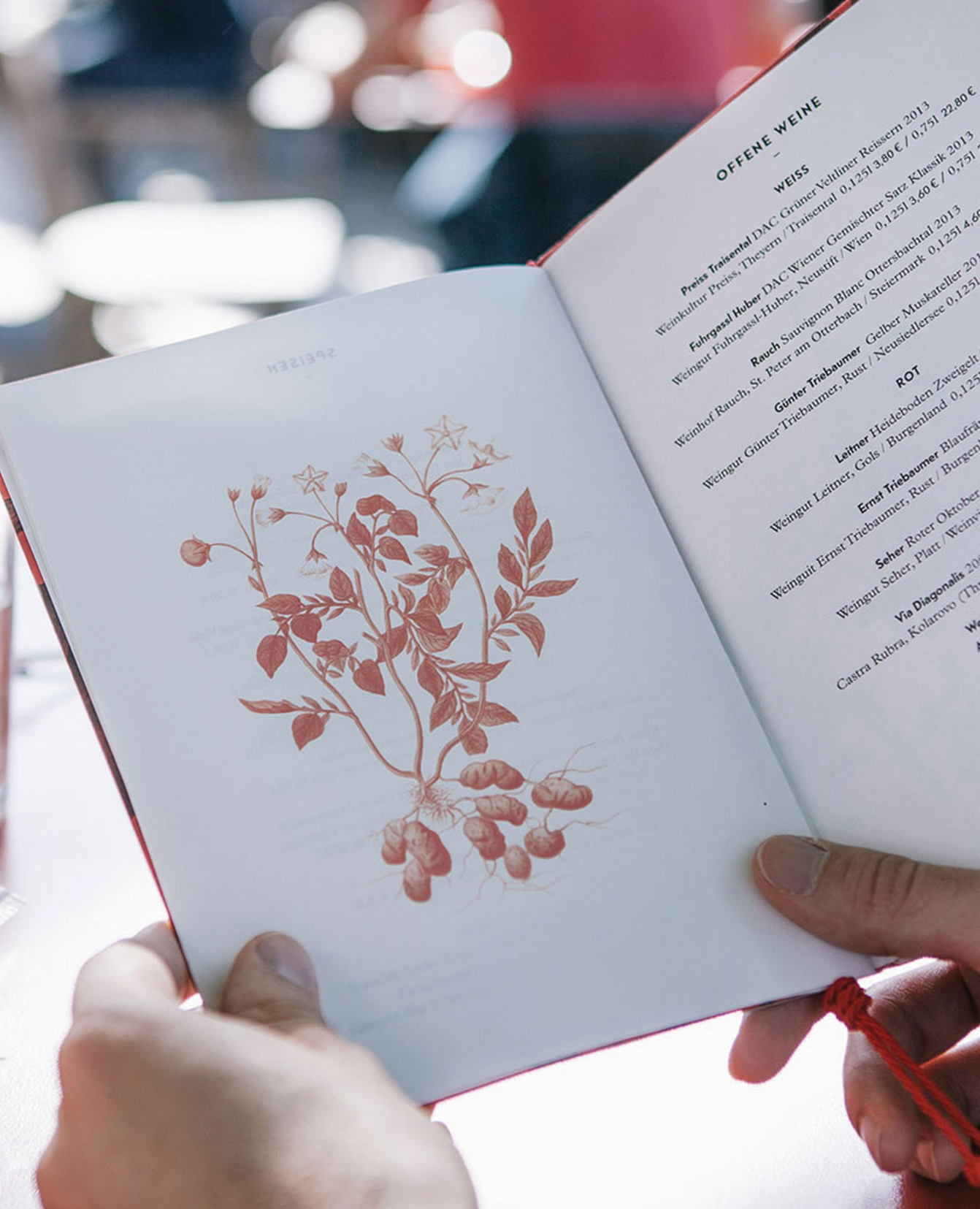
Detail menu card with red illustration
Labels for take away packaging, with illustration for carnivorous and vegetarian dishes
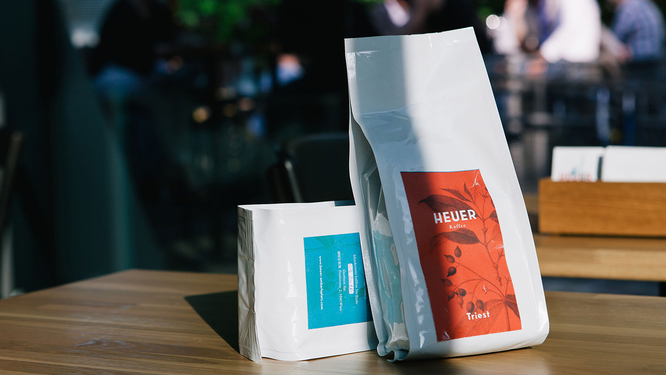
Packaging design of the in-house coffee
Packaging design of the take away boxes with applied stickers for branding and labeling of the dishes
Illustrations to mark the restrooms are part of the orientation system in the same style of branding
Muh!