Loading …
X42 – Architecture Studio
Branding & Website
The relaunch of the smart Vienna-based architecture studio comes with clear goals: a strong outward-facing visual identity, a website that invites both exploration and targeted project searches, and professionally crafted case studies that communicate their competence and services with confidence.
The starting point and foundation for the design work were strategy workshops and qualitative discussions aimed at sharpening their profile, making their ethos tangible, and strengthening X42’s position within the architectural landscape.
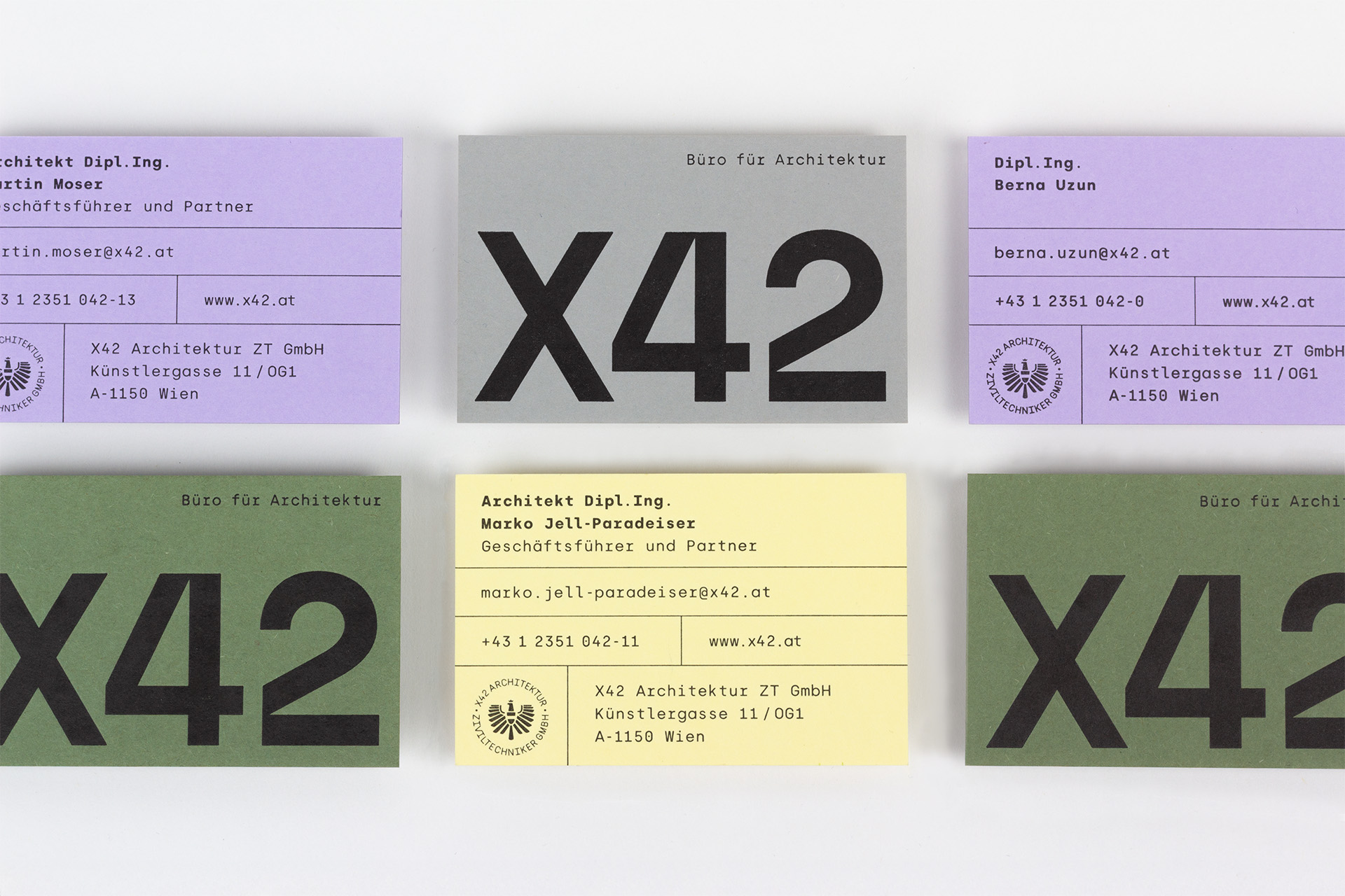
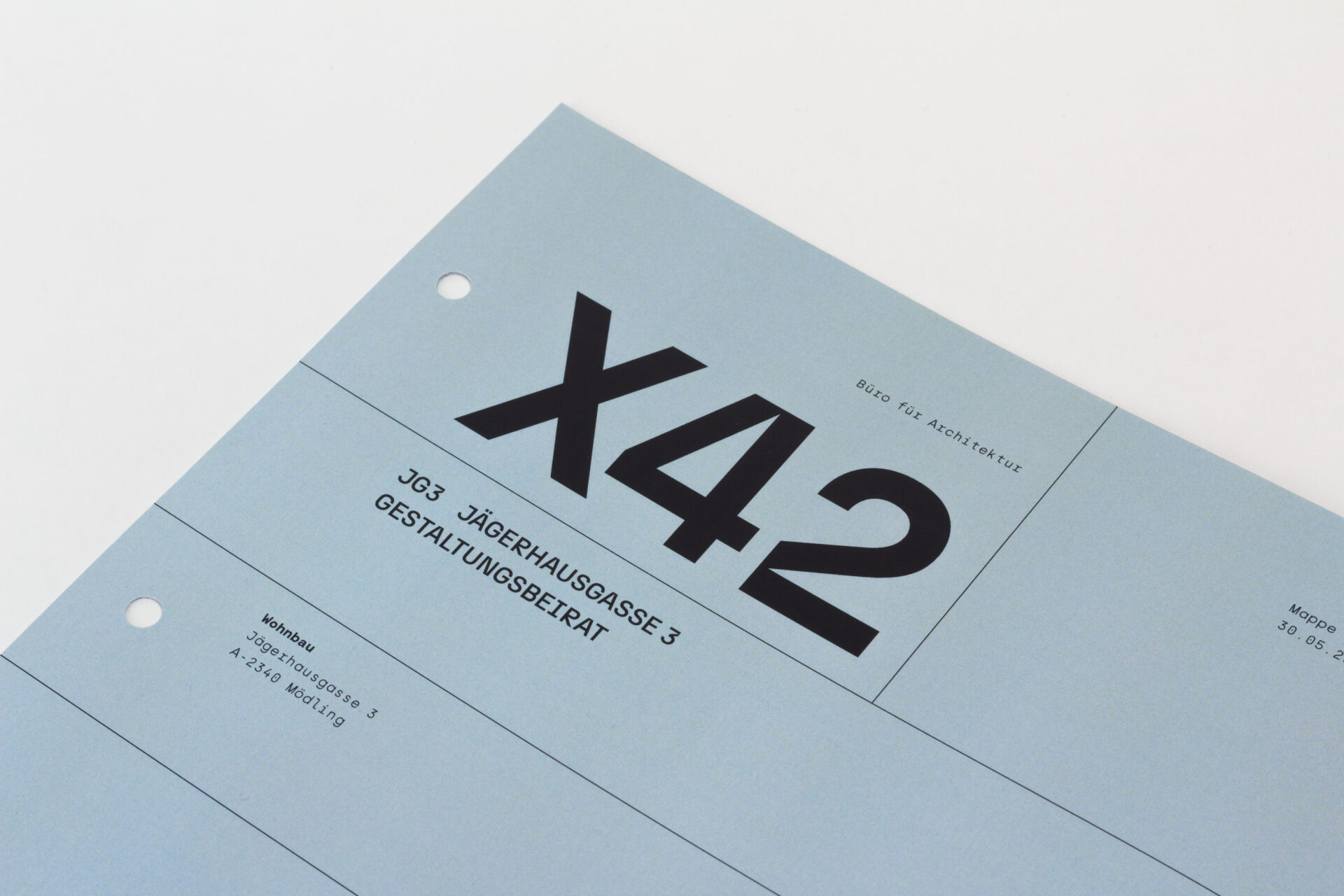
The Site Plan as Logo Inspiration
A black-and-white site plan clearly shows how a project can blend intelligently into its surroundings. For us, it captured X42’s careful approach and became a strong inspiration for the new logotype. The established name was intentionally kept, with the addition of ‘Architecture Studio’.
Order as a Design Principle
Clear filters and an easy-to-navigate index quickly guide users to the right category or a specific project based on their interests. Designed with a mobile-first approach, the new website ensures optimal usability on any device.
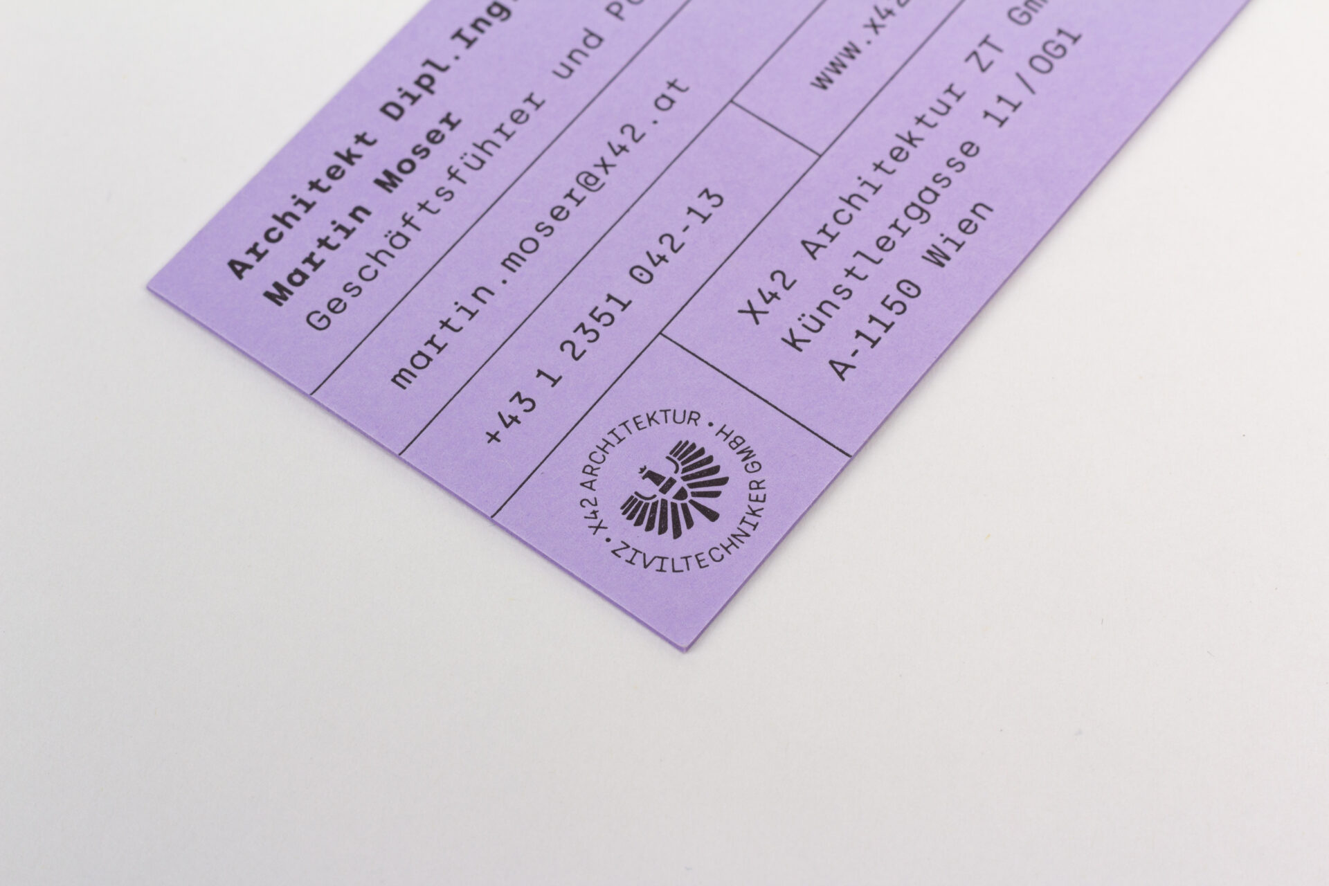
Another inspiration for the design came from the fields and frames used in architectural plans to structure different areas. Fine lines now organize the content across all media, creating a contrast with the bold typeface.

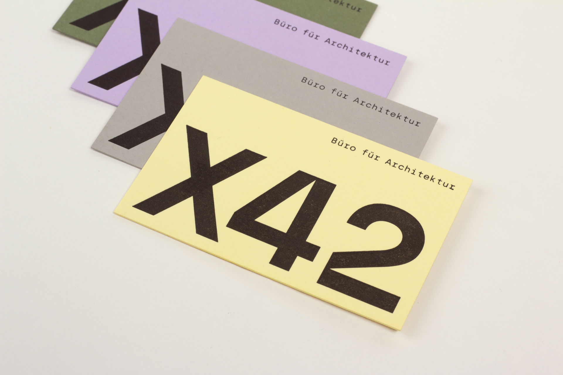
A Gentle Color Palette
A palette of soft pastel colors runs throughout the brand identity. On the website, the colors help guide users through the sections, while in print they add lively variation across the different materials.
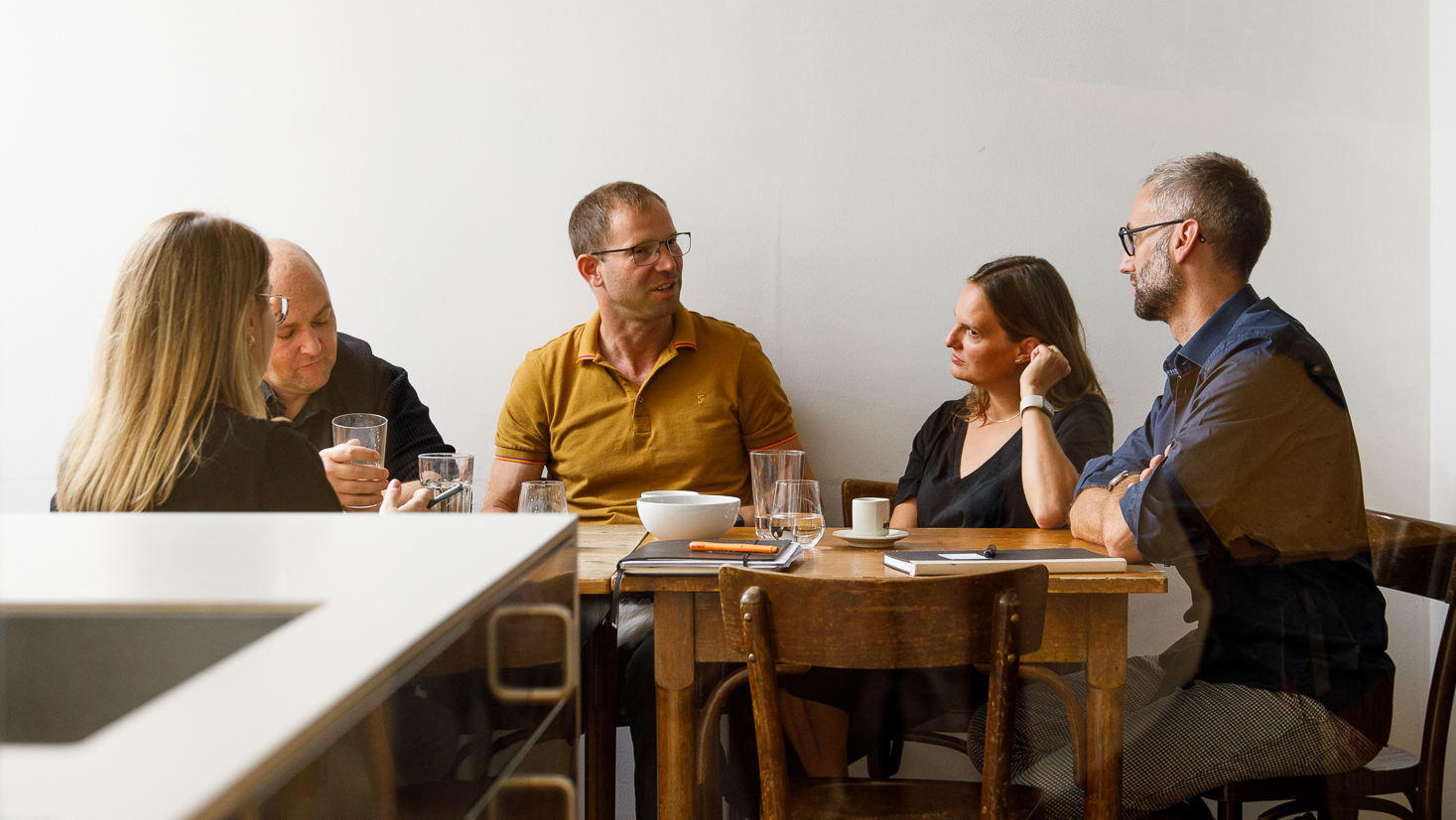
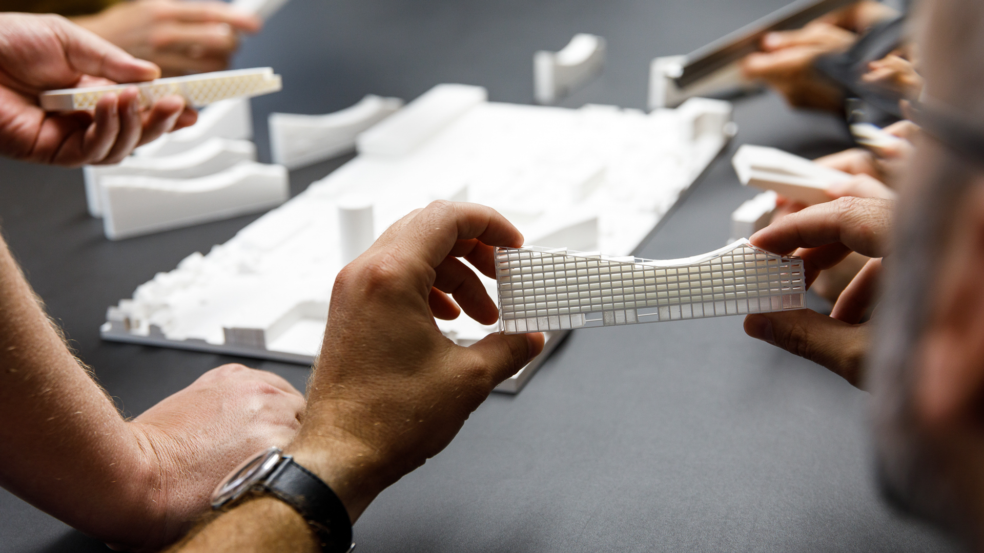


Friendly, Relaxed Imagery
X42’s clients emphasize the personal and professional support they received throughout the entire project. This blend of approachability and expertise is captured in the portraits and candid shots of the team, with Max Kropitz perfectly conveying the atmosphere of the studio in his photography.
In Cooperation with
Max Kropitz
Photography