Loading …
Wien Museum
Inclusive orientation for all
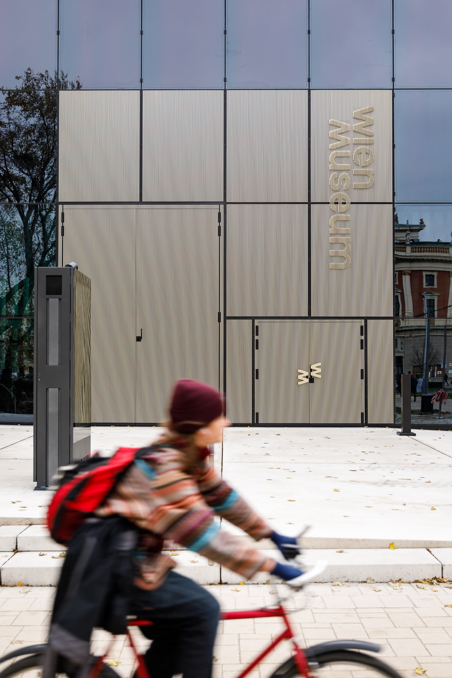
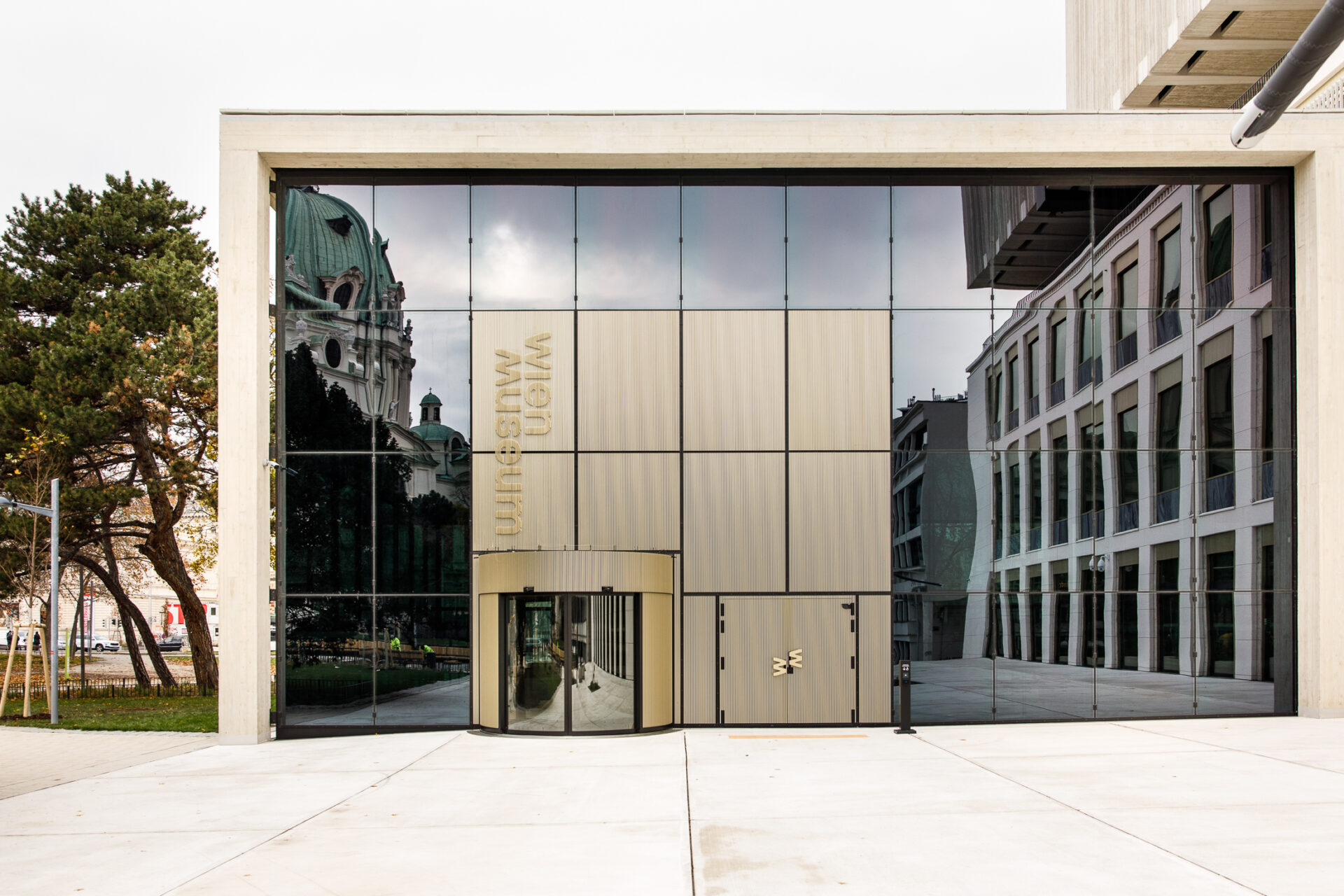
Undoubtedly one of the most prominent museum locations in Vienna and now also an urban landmark: the architecture of the new Wien Museum between Karlskirche and the Musikverein combines the elegance of the 1950s building by Oswald Haerdtl with a striking and monumental extension by Čertov Winkler Ruck.
Designed to be open and inclusive, our signage makes the new universal museum accessible to all visitors without restriction: analog and digital communication without barriers guide through the permanent and special exhibitions and to the comprehensive infrastructure, including the restaurant and store – in complete harmony with the historical and contemporary architecture.
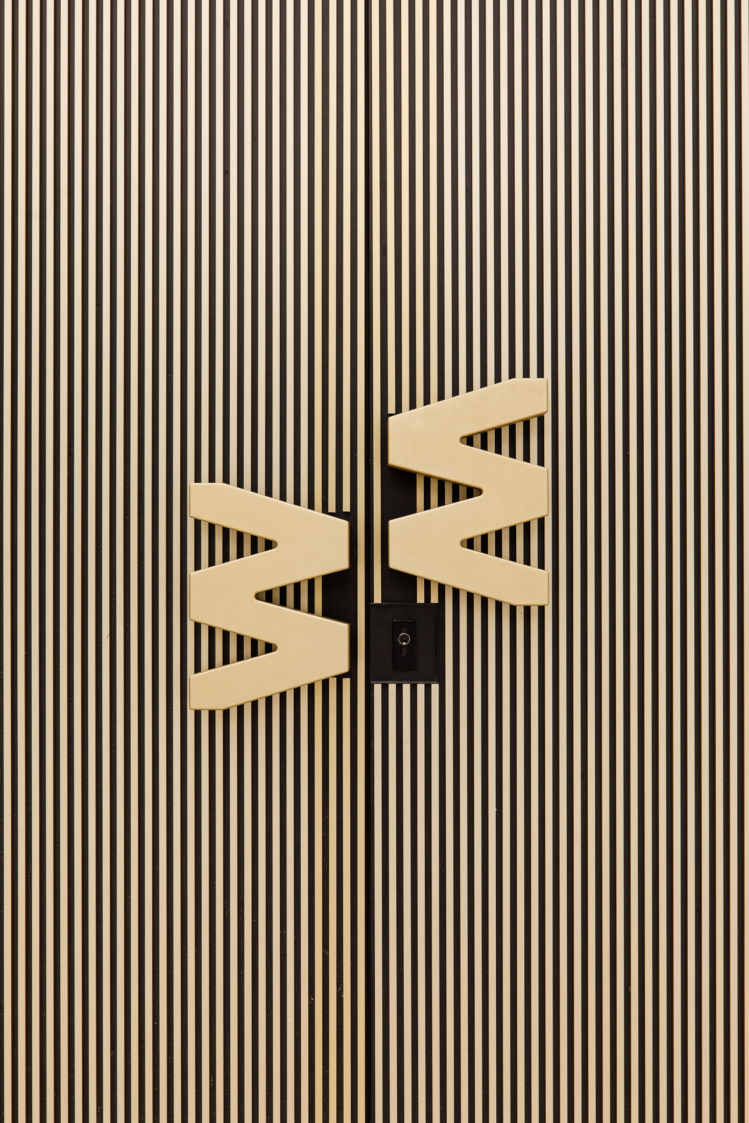
The tactile signet on the doors
Especially for the two entrances to the foyer, we extracted the “W” and “M” from the lettering as a short form and had them cast in aluminum as door handles. This makes the brand directly tangible.
Light models the lettering
Raised aluminum bars subtly lift the lettering out of the façade. Depending on the lighting mood, the brand changes its presence and visibility.

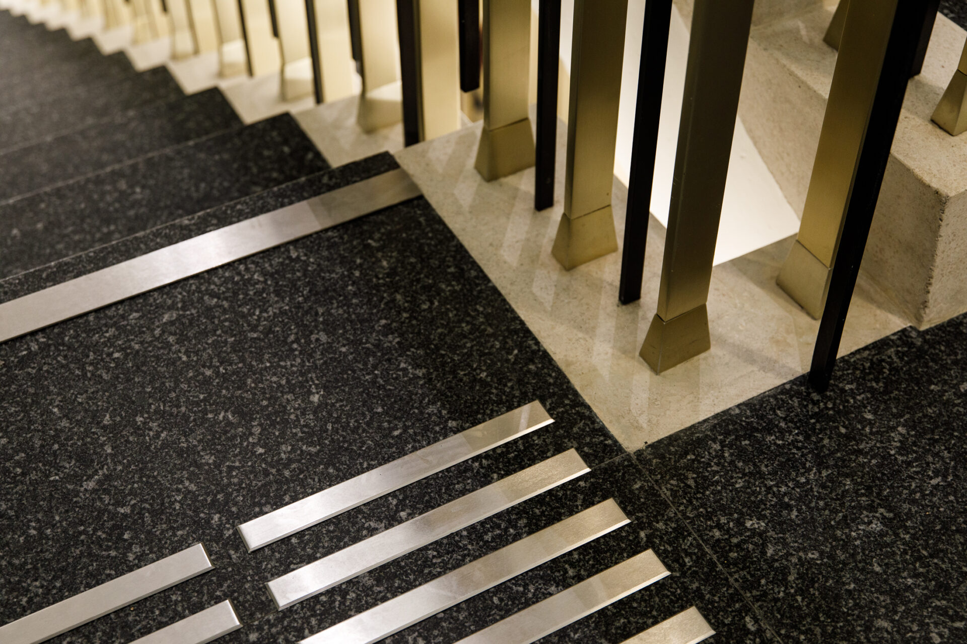
Haerdtl's elegance as design inspiration
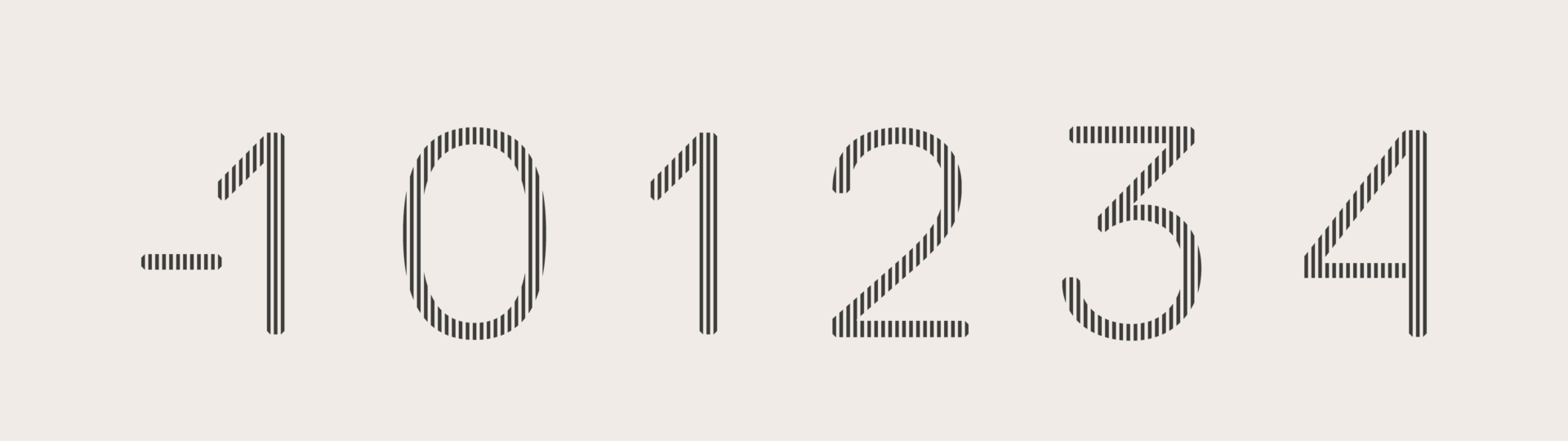
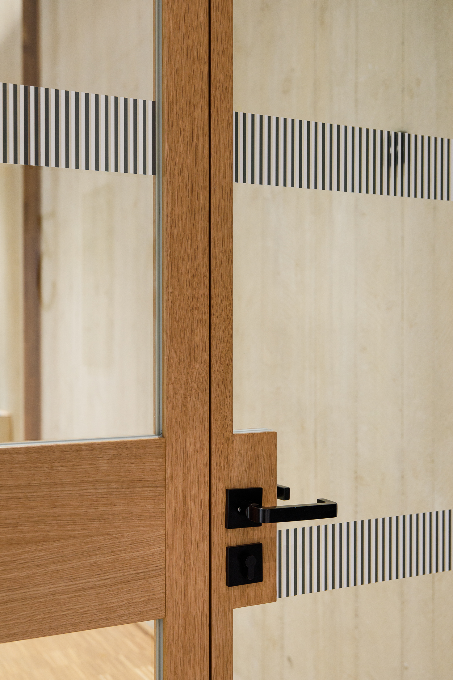
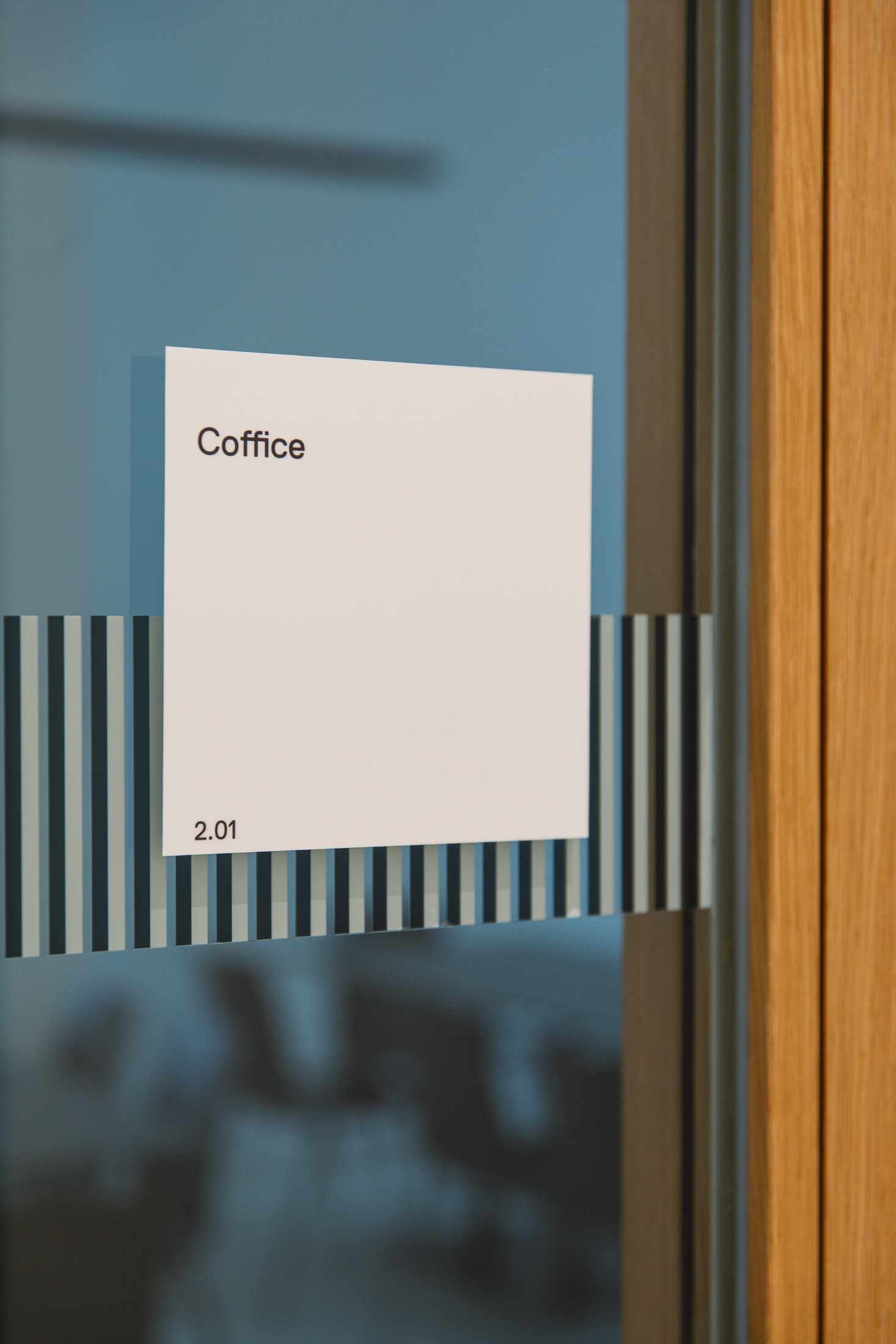
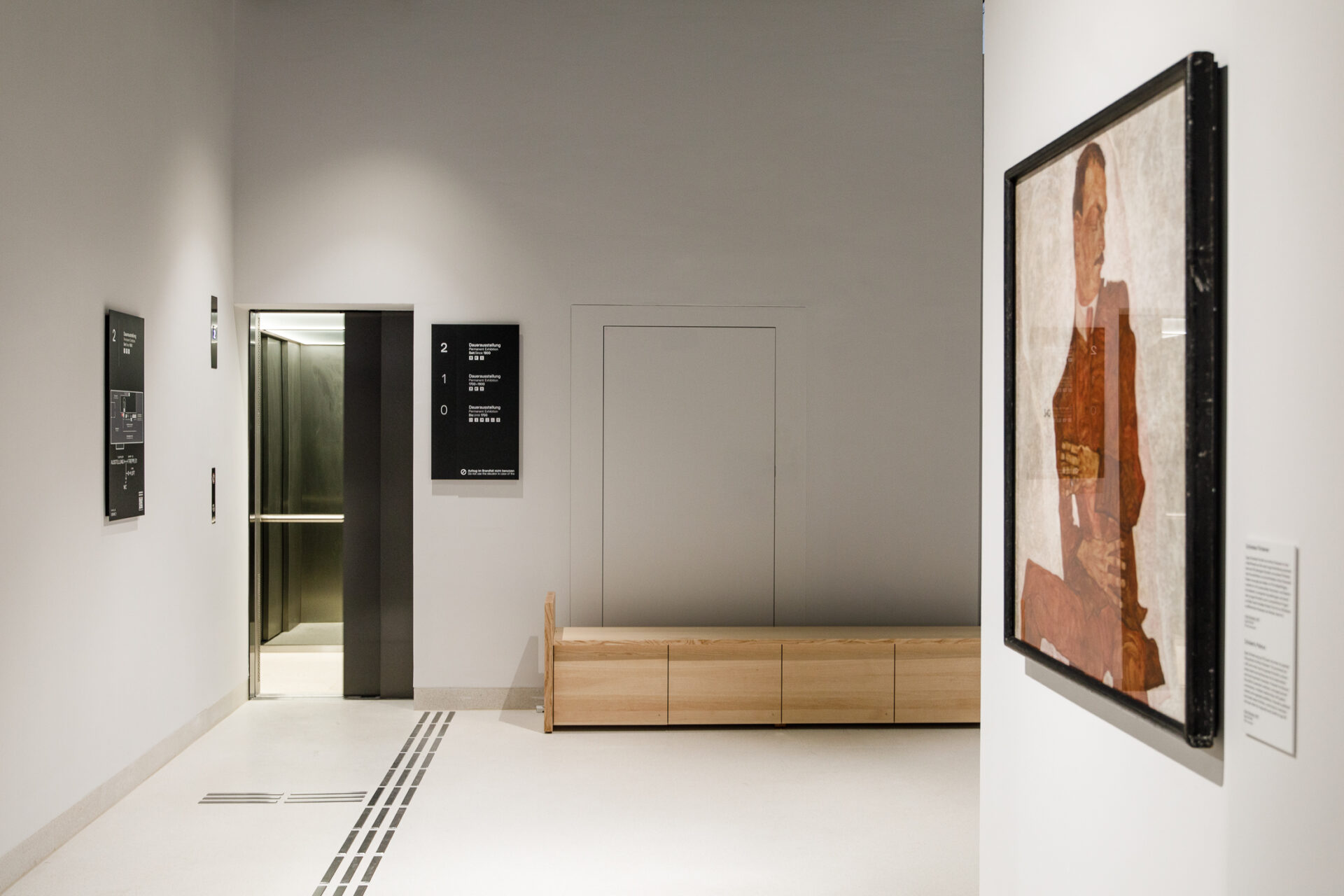
From the lettering on the façade to the floor numbers and the impact protection on glass surfaces, the signaletics quote Oswald Haerdtl’s elegant striped structures in anodized aluminium.
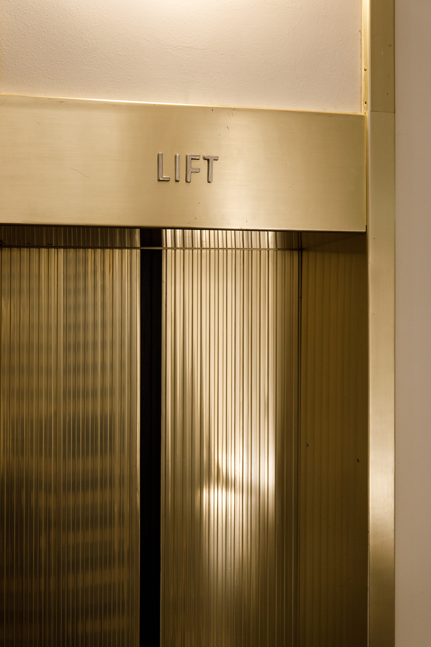
With their matt black surface, all the information carriers form a formal unit with the architectural features. They are present and yet at the same time blending in.


Inclusive from the foyer to the objects
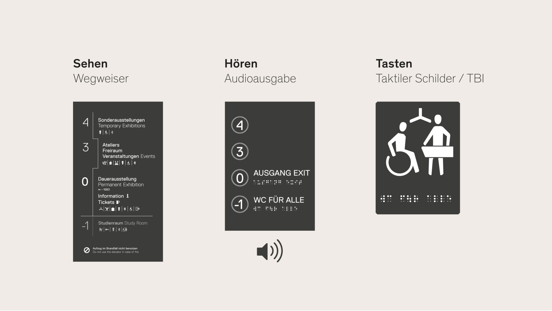
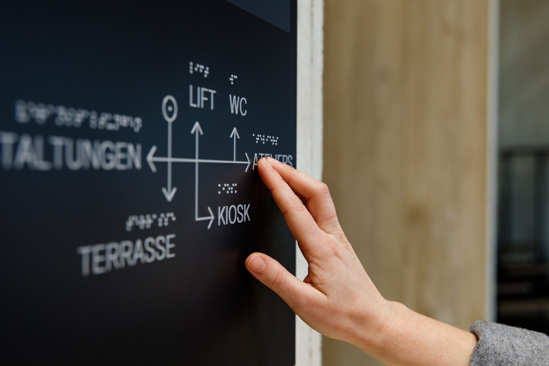
Even though sight is the most important sense of orientation for everyone, support is also needed for all people with special needs. If one sense fails, even partially, a backup is offered for one or two other senses.
In the spirit of an open universal museum for all, we developed a seamless, barrier-free system with the inclusion team. It ranges from the tactile touch model in the foyer to guidelines and audio outputs to the guide objects in the permanent exhibition. All services in the building are consistently integrated.
Tested several times and intensively with users / associations in advance, our design follows the principle of user-centered design.

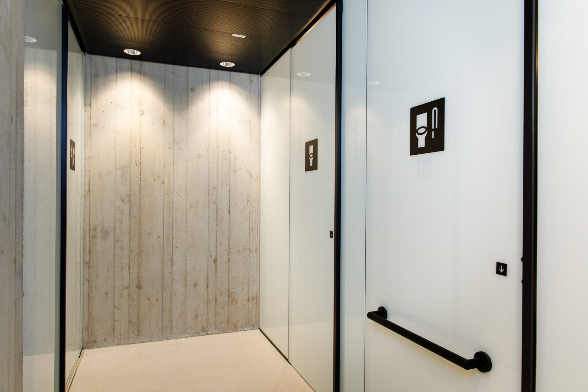
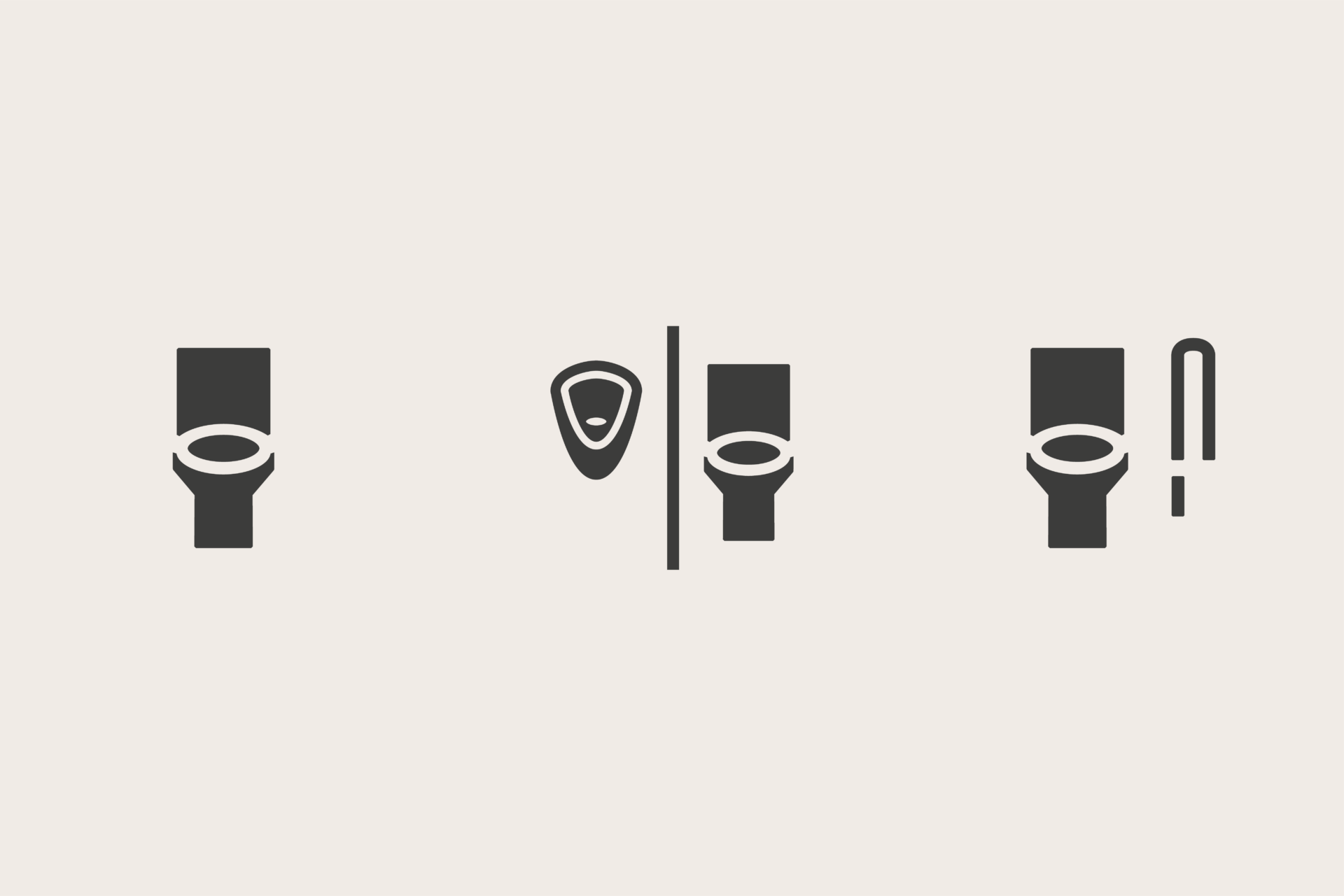
Toilets for all
Inclusion also includes the free choice of gender – a good example of this is the deliberately non-binary toilet symbols. Instead of men’s and women’s symbols, the sanitary facilities are not gendered and refer to their sanitary function only. Everyone is free to decide for themselves which facility to use.