Loading …
Milchbar Norderney
Packaging Design
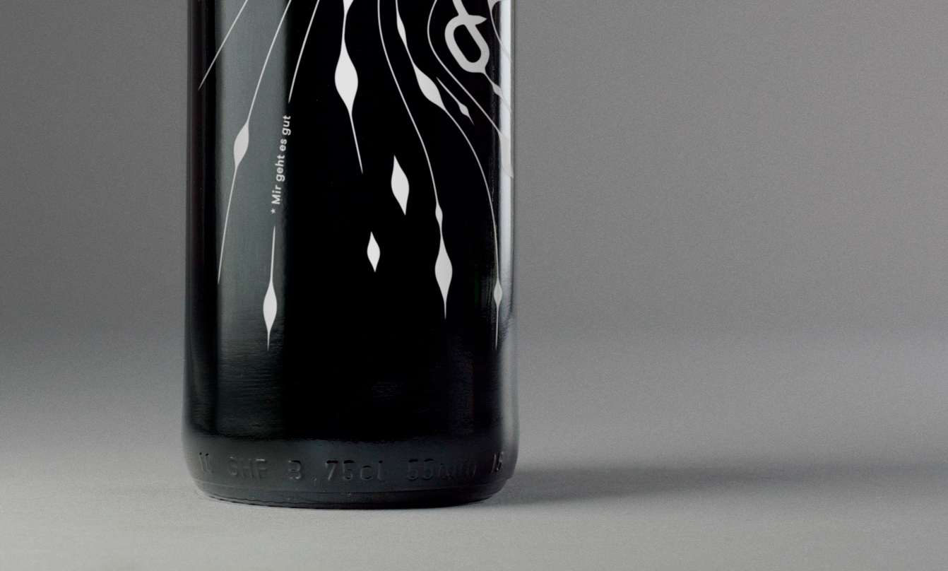
Located on the North Sea island Norderney, „Milchbar“ is a popular place for stylish hangouts right at the beach. The restaurant’s new house wines, pressed by the vinery Schloss Hallberg in Franconia, are the benchmark for the corporate design. The packaging of the wines combines Low German quotes with illustrative interpretations of the island’s natural geographical elements: wind, water and sand.
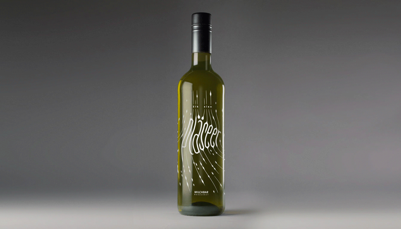
The text idea for the series of white, red and rosé wines gives the product a distinct local East Frisian character. This kind of dialect feels like a mixture of German, Dutch and English – that’s how even international guests can take a guess what the quotes mean. The main words are boldly illustrated, refer to the drinking pleasure and give each wine its name.
The sujets are directly applied through ceramic silk screen print all around the bottle. The minimalist non-glossy black screw cap of newest technology gives the wine its premium finishing touch.
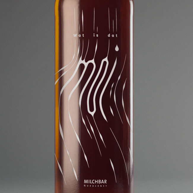
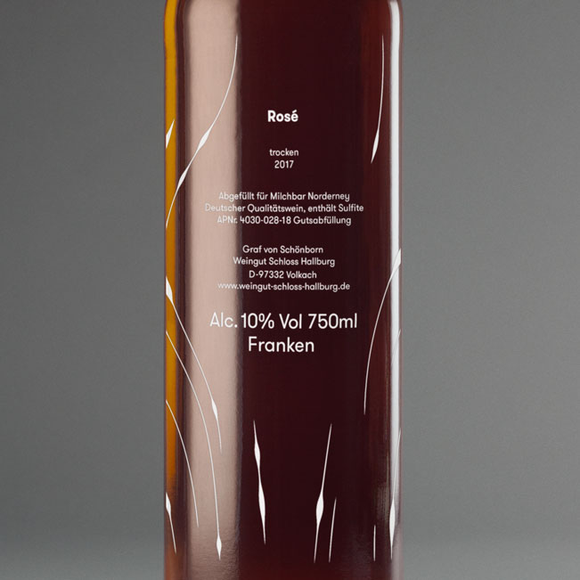
Rosé – Wat is daut moi (How beautiful is that)
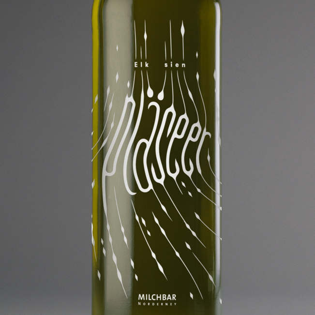
White – Elk seen pleasure (To each their own pleasure)
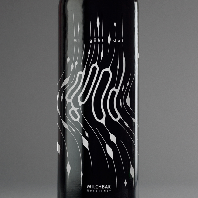
Red – Mi gäht dat good (I’m doing good)