Loading …
MED22 Health Center
Orientation System & Building Signage
This small local medical center combines the services of 13 different doctors. Therefore, the orientation system should transport a common visual language and provide security and clarity.
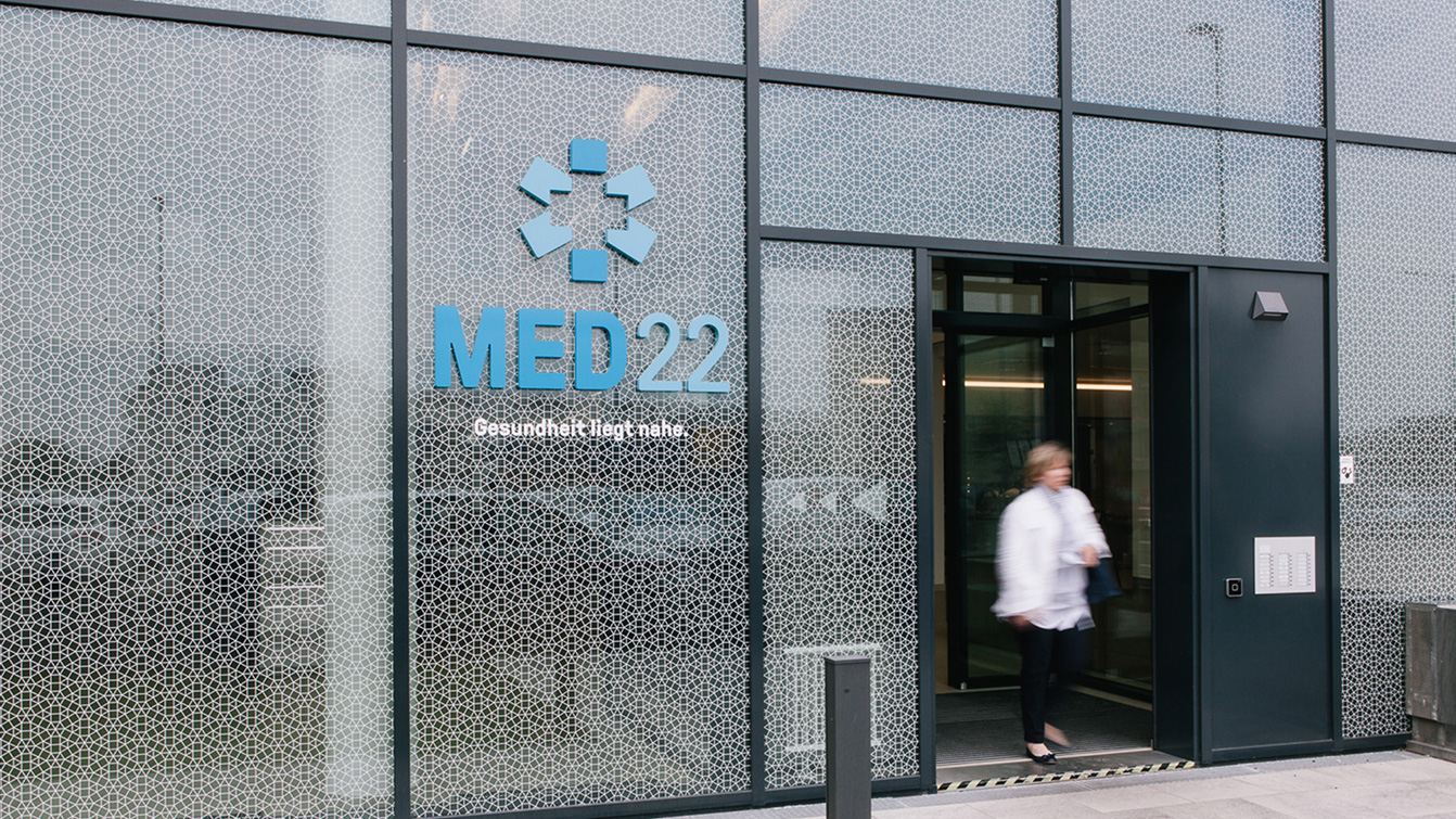
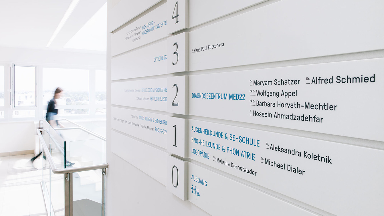
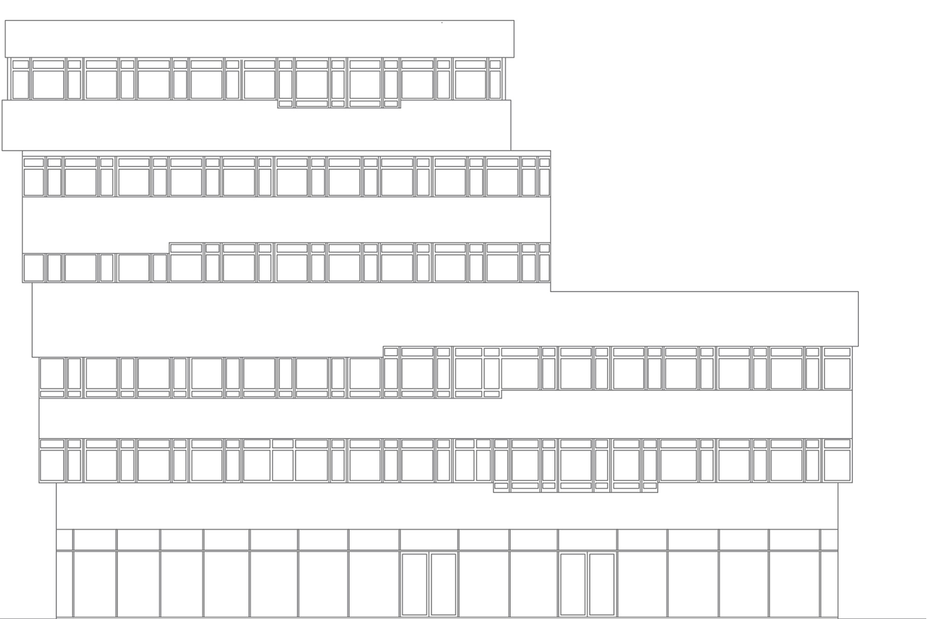
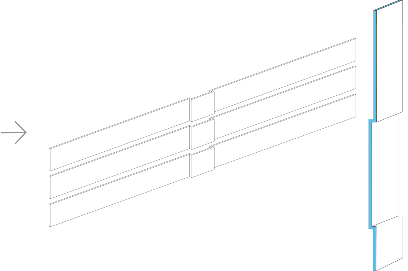
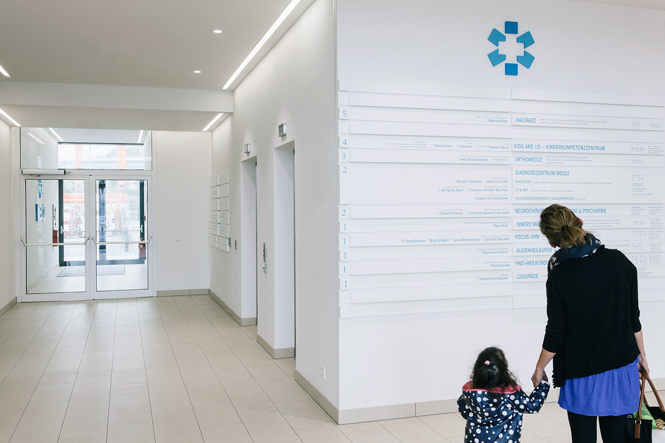
Different medical services combined and connected on one location: quick appointments, interdisciplinary work and alternative services offer patients a whole new approach to medical care at this health center. From bus station to doctor’s office, patients can find and make their ways intuitively and easily. All white, the elegantly folded information carriers lead the way and refer to the facade of the building. For further information, patients can make use of the reception at the lobby or the big synoptic board.
Expandable Corporate Design
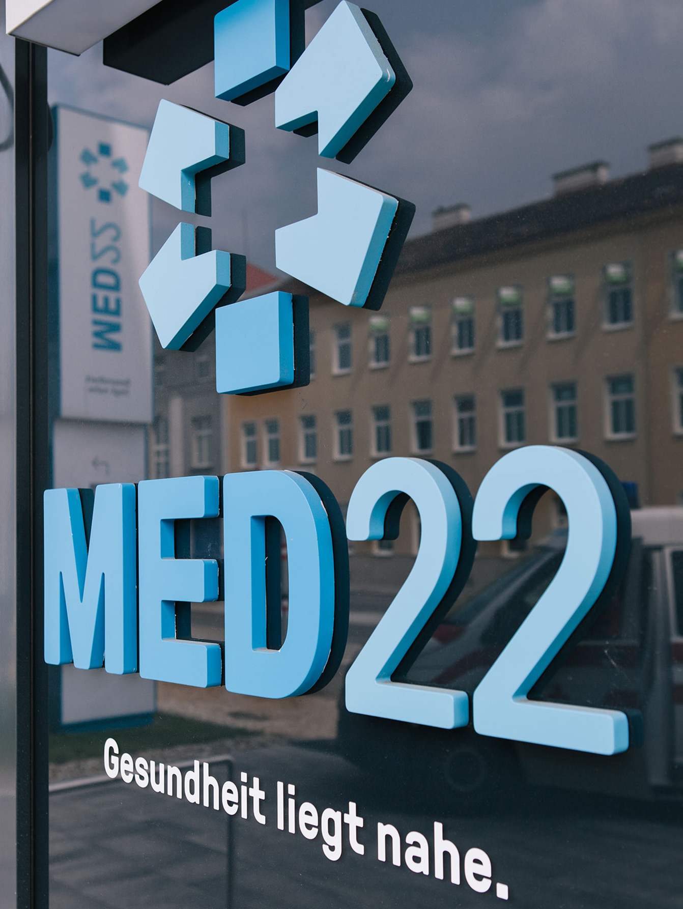
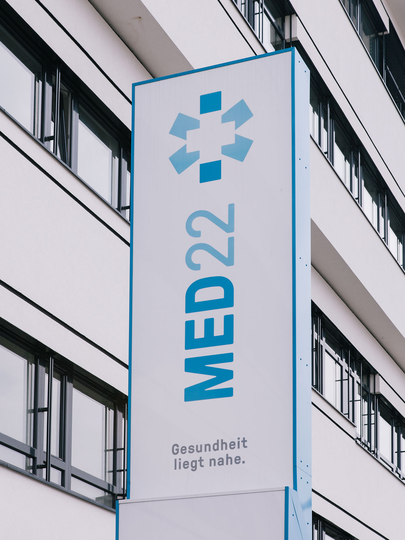
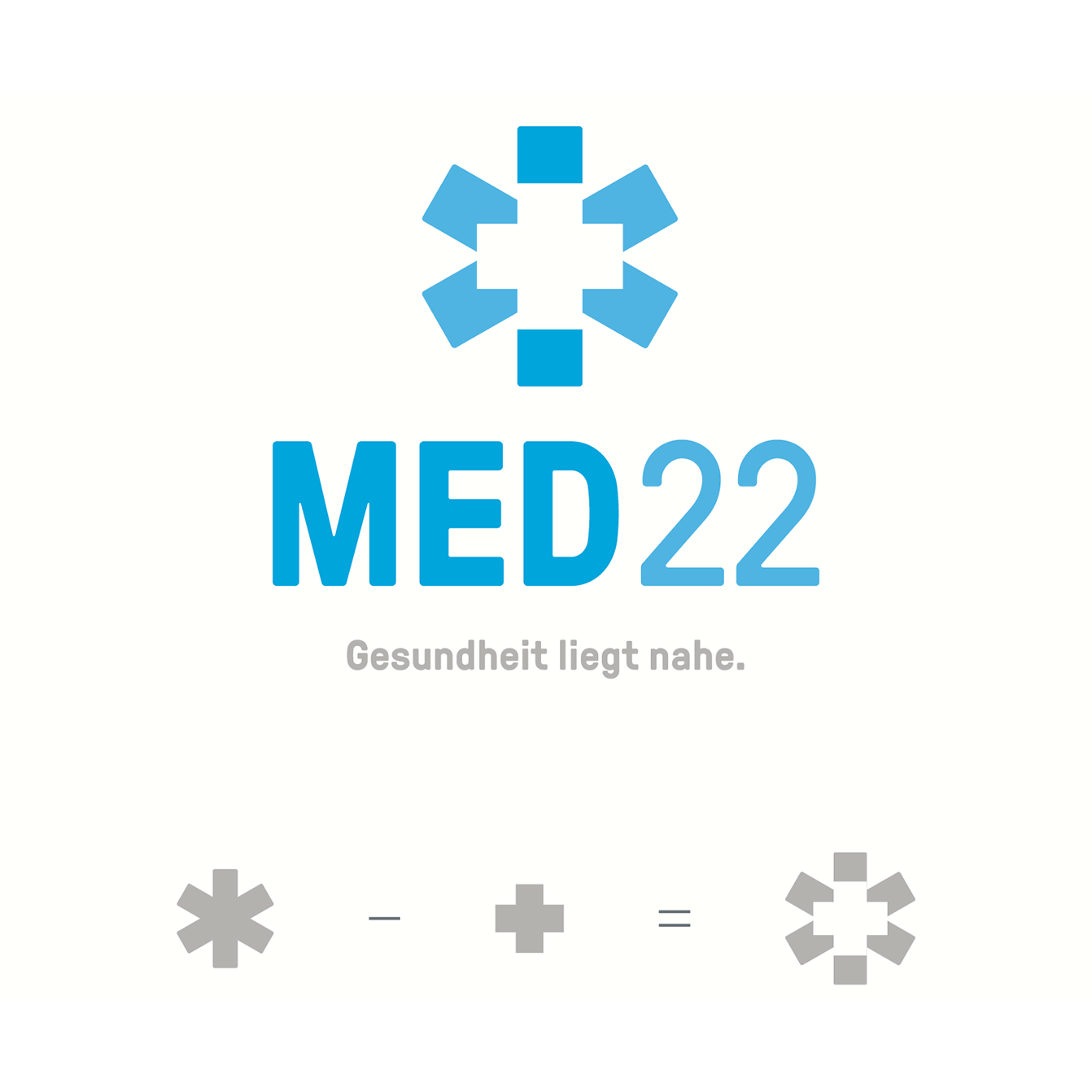
Central element of the visual language is the star-shaped image. Maltese cross and red cross melt into one significant new shape. The brand is complimented by a finely structured texture that spreads over the walls and glass facade of the building.
The corporate design for the building can easily be adapted for new locations, if needed. A clear coloring and nomenclature can position future health care centers in the same clear way like MED22.

